
Wix App Review
The Wix Owner App offers a comprehensive set of features and capabilities, however, the App does come with a learning curve and limitations, especially when compared to the desktop version.
FREE | PRO – $0-00/MONTH
OVERALL RATING
HOW WE REVIEW Wix
A diverse group of testers were asked to build a website, from start to finish, to assess the strengths and weaknesses of Wix from different perspectives:
Read the full HOW WE REVIEW section
- Ease of Use (User Interface and Design)
- Features & Functionality
- SEO (Search Engine Optimization)
- Performance & Reliability
- Support & Documentation
- Pricing & Value
By methodically evaluating these criteria, our testing process aims to provide you with valuable insights into where Wix excels and where it is lacking. Ultimately, our objective is to help you choose a website builder which offers a user-friendly, clear experience, and which helps you create an effective and visually pleasing website for your business or project. We also look at whether Wix adheres to ethical business principles in its relationship with its users.
For a complete understanding of each review section and its subsections, please refer to our detailed methodology page. If you have more questions, our FAQ and glossary sections are there to provide further clarification.
Sign-Up & Setup in Wix Mobile Apps
Sign-Up
Wix offers account creation by email, or using your Google, Facebook and Apple (in the iOS App) logins.
Setup
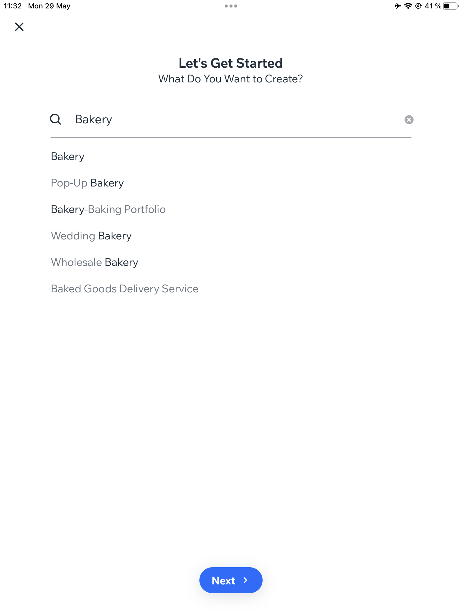
There’s a wizard.
EASE OF USE
Wix received mixed reviews from our testers for terms of ease of use, with an overall rating for this metric of 67%. Some users found the interface straightforward, with helpful text prompts and visual cues. However, others mentioned that certain aspects could have been clearer, such as the map feature and section naming. Several testers also noted that the App feels a bit overwhelming due to the abundance of features.
Read the full EASE OF USE section
User Interface and Design
For a mobile website building App to be considered easy to use, it should have an intuitive and user-friendly interface that is easy to navigate with touch controls. The App should provide clear and concise instructions on how to use its various features and tools, and it should allow users to easily preview their website and make changes on the go.
Intuitive Interface
The app generally offers an intuitive interface, with clear icons and labels. Users appreciated the presence of suggestive dummy text and visual cues. While there were positive remarks about straightforwardness, some users mentioned that it can feel a bit heavy initially but becomes more manageable with time.
The App is huge, so there’s a significant learning curve. It’s not only a website builder. It’s a complete platform, with a store and marketing manager, analytics, booking manager, tasks, calendar, invoices, payments manager and so on …
Learning Curve
The App is huge, so there’s a significant learning curve. It’s not only a website builder. It’s a complete platform, with a store and marketing manager, analytics, booking manager, tasks, calendar, invoices, payments manager and so on Wix fared well in terms of accessibility for users of different skill levels. The App offers a wide array of features, and while our testers found that the main site editing tools are relatively easy to learn, some mentioned a significant learning curve. The friction was caused partly because the website builder itself has so many tools and features, but also because the app has many components, such as for order management, for marketing tool, to do lists, and so on, which are only loosely related to website editing.
Working With the Wix App
The app received mixed feedback here, with testers expressing varying levels of ease in completing tasks. While the app’s navigation was generally easy to understand, some features are only available on the desktop version, and certain options are buried within the app. Some testers felt that the website building process was not always smooth and involved too many steps.
Instructions and Tooltips
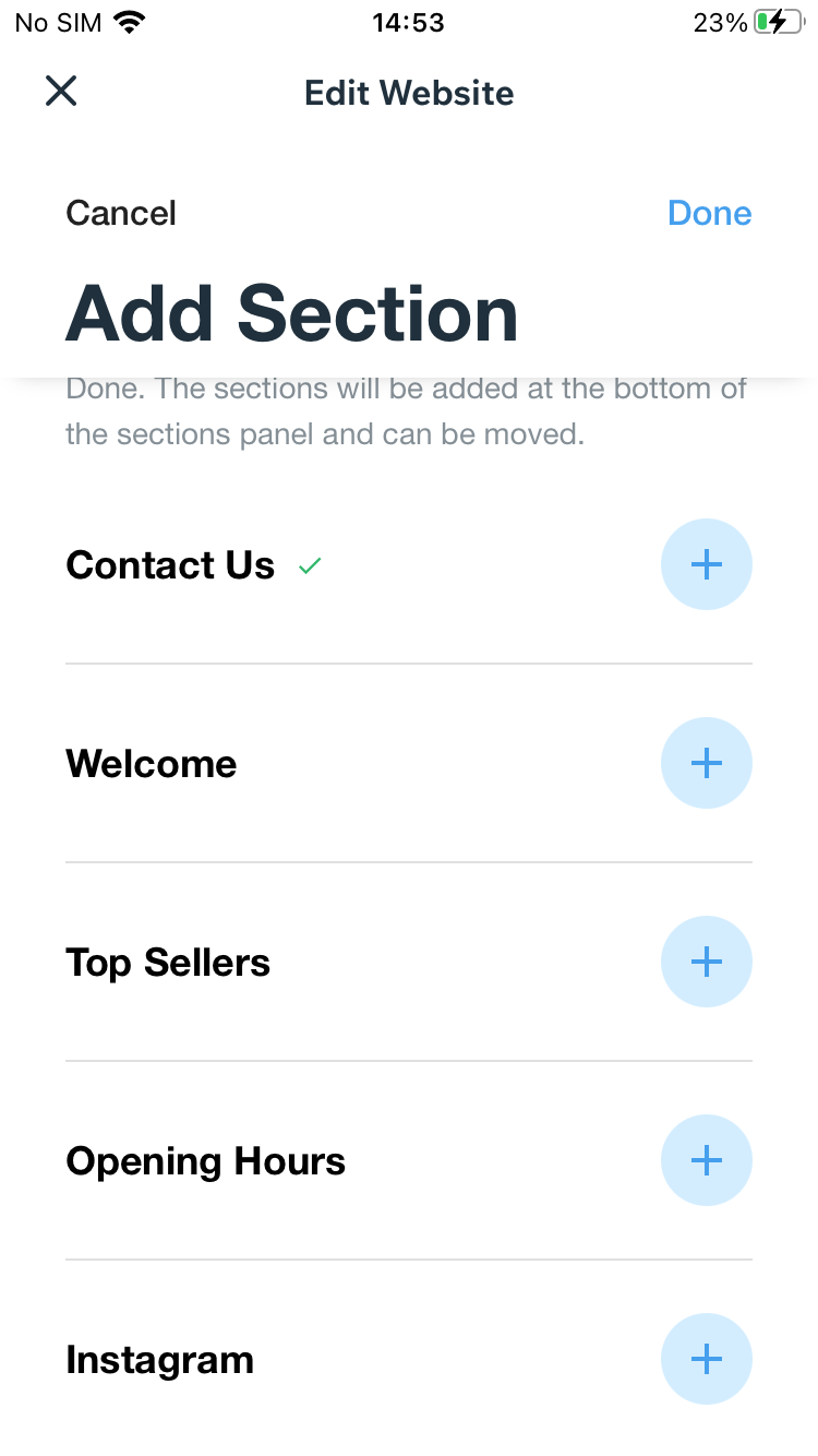
The app’s guidance was on the whole found to be clear, with testers generally finding the instructions and tooltips to be helpful. However, there were suggestions that the tips could be improved, and some testers noted difficulty in understanding the different sections from their titles.
Visual Hierarchy
The app’s visual hierarchy was appreciated by our testers, who found that the various elements were logically organized. However, there were mentions of certain design elements being unclear or confusing, such as clickable areas and navigation buttons.
Consistency
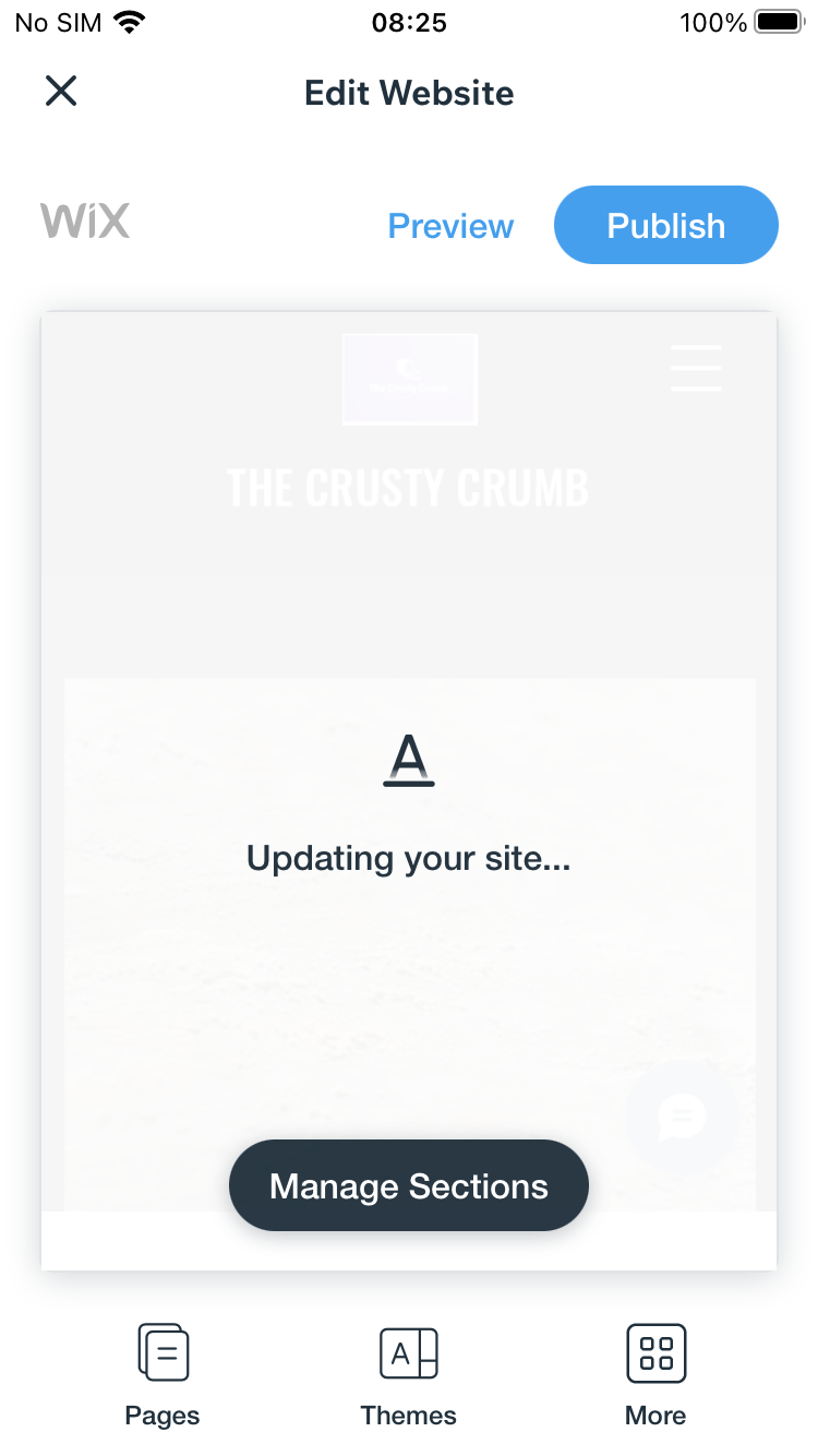
Wix maintains consistency in its design and behavior, but some testers encountered bugs or issues that affected their experience. For example, after applying changes two of our testers reported that the mobile view of the website disappeared, and only the desktop view was available, making the website uneditable. One of those testers noted that the mobile view eventually restored after several minutes wait. Overall, while the design was found to generally be clean and consistent, there were moments of confusion caused by apparent bugs or display problems.
Template Variety
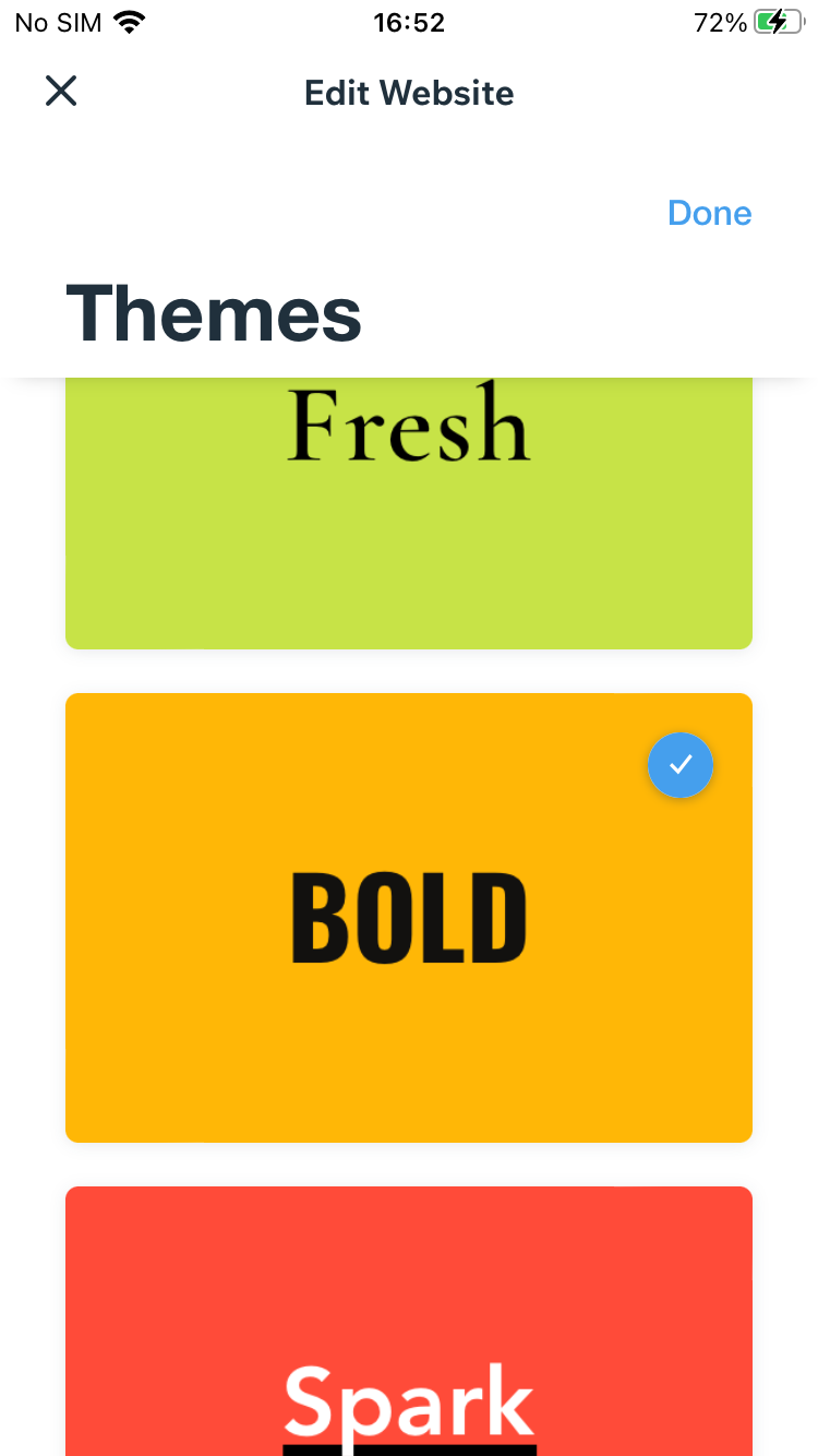
Surprisingly, for a website builder famous for it’s large library well-designed of themes, Wix garnered mixed reviews for template variety. Testers’ ratings varied from 1 to 5 out of 5, suggesting diverse experiences. Some testers expressed disappointment with the limited template options, with one user noting that only the fonts could be customized. Others, meanwhile, mentioned that the app offers various layouts and templates suitable for different industries and use cases. The key here is likely that the mobile app provides access to only a tiny fraction the themes available in the desktop version of Wix, and the app also does not offer the vast majority of customization options available on computer.
Design Flexibility
Design flexibility ratings vary significantly. Some testers found it easy to customize colors, fonts, and other design elements, giving the app a high rating in this category. In contrast, other testers express disappointment that they could only customize the fonts, with some mentioning that customization options are limited to the choice of themes.
Business Ethics
We asked our testers to judge whether they felt that the primary focus of Wix is to help user’s create effective websites, or to push products, services and paid upgrades. While some testers felt that the app genuinely aims to assist website creators, others sensed a strong emphasis on marketing efforts. The most revealing comment was probably the following, from one of our testers, “I think that the app is designed to genuinely help users (who created their website on the desktop) to manage their website while on the go.” This particular tester clearly felt that the app was designed to be helpful, not as a standalone website builder app, but as a companion to the desktop website builder.
I think that the app is designed to genuinely help users (who created their website on the desktop) to manage their website while on the go.
Education
Our testers has fairly consistent views of Wix’s efforts at educating and supporting its users in their use of the app to create functional websites. While acknowledging the presence of a knowledge base, most found the educational resources and support lacking, especially for users of the mobile app.
The Quality of the Result
When looking at how far Wix focuses on helping its users in creating strong, organized content, some testers appreciated the pre-built content, others mentioned a lack of emphasis on content. Opinions were pretty consistent that the app relies too heavily on add-ons and features for perceived site quality.
Overall Impression
Wix gets an average of 67% for ease-of-use overall. There are clearly areas needing improvement. Where there were positive comments and ratings, these were mainly focused on the intuitive interface and clear visual hierarchy of the app’s design. The more negative judgements related to the app’s complexity, customization options, and consistency. Our testers also hoped to see more focus on education, ethics, and content quality.
FEATURES & FUNCTIONALITY
The collective rating for features and functionality averages at 70%, suggesting predominantly favorable opinions about the App’s capabilities. Testers value the array of features but have also highlighted noticeable limitations and areas that could benefit from enhancements.
Read the full FEATURES & FUNCTIONALITY section
Features
Features refer to the tools, functionality, and capabilities that each app provides for users to build and customize a professional-looking website. Because our review is exclusively of the mobile app, and not of the browser-based builder, a key metric is how much of the website builder’s feature-set is available in the app.
Pretty incredible what’s in this app. It has more than many desktop website builders.
FUNCTIONALITY
The features of the Wix Owner app received consistently high ratings, and testers generally commented that the app is well-equipped with a variety of features, in line with those ratings. Some testers found the app straightforward to use and appreciated the vast range of features and tools in the app, noting that they were on a par with what you might normally find in a desktop website builder. Interestingly, other testers failed to find basic features, like image editing and Google maps, again suggesting that the size and complexity of the app makes it difficult to learn.
Extensibility
Wix received high ratings for extensibility, with users appreciating the support for additional features and plugins. The app’s capacity to expand its functionality was noted, with testers mentioning options from hiring professionals to a booking manager, creating email campaigns, creating Android and iOS apps, and online stores. A note of criticism is that some of the extensibility comes with hidden costs.
Collaboration
Collaboration ratings were generally very high, with testers noting the presence of collaboration options such as user management, up to 10 different user roles and membership and community settings. While some testers highlighted features like community badges, others point some of the features require downloading another Wix app called Spaced. One tester failed to find any of these options.
Customizability
Customization refers to the level of options and flexibility that the app provides for designing a website.
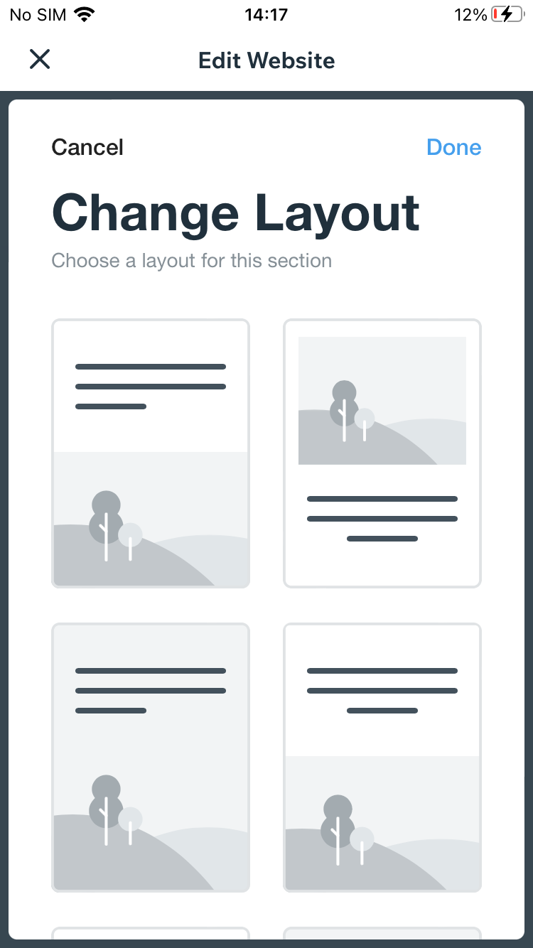
It’s a little limited. There are layout options for each section. I found out that if you start in the app you are using Wix ADI (Artificial Design Intelligence). This is not the same as the default editor on desktop, although you can also access Wix ADI sites on desktop. At one point my site broke completely and I lost access to editing all sections. I would like to give up but I’ve come so far so will continue to the bitter end. Update: The website got fixed automatically after 30 minutes or so. I can edit everything again. There must be caching or script issues.
Wix’s customizability received mixed feedback regarding the level of control over layout and design elements. Some users found certain customization options limited, especially in terms of colors, fonts, and feature control.
Layout Control
Our testers found the layout control options very limited.
Design Control
Testers generally found customization options were limited to the actual choice of themes, plus adjustments to fonts and images.
Feature Control
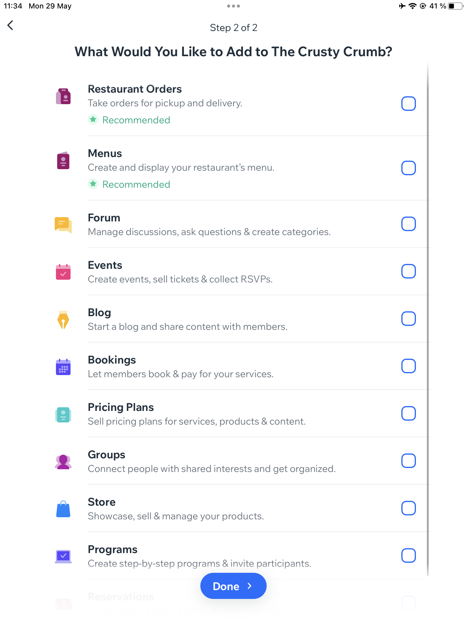
Wix scored quite poorly here. None of our testers could find any options for customizing features like menus, forms or galleries. One of our testers noted that almost everything depends on how you define your website and business in the wizard stage at the beginning. Once these choices are made, there very little you can do to adjust things later on.
Integration options
Integration options refer to the ability of the app to connect and integrate with external services, platforms, or tools to enhance the functionality and capabilities of the website being built.
Its not always clear what is a 3rd party app and what is internal
Third-Party Integrations
Integrations ratings range vacillated, with testers expressing varying levels of satisfaction. While some testers appreciated the integration possibilities, others find it unclear whether certain features are third-party apps or internal to Wix. The ability to connect with popular tools, social media platforms, e-commerce solutions, and analytics tools is noted.
Seamless Connections
Seamless connections ratings varied. Some testers acknowledge the smooth integration of features, while others indicate a lack of testing due to time constraints or concerns about personal credentials.
Language Options
While the UI is available in different languages, multi-language functionality for publishing is not provided within the app.
Overall Impression
The Wix app offers a wide range of features and functionalities that cater to various user needs. While some testers found customization options limited in certain aspects, the app’s extensibility, collaboration features, and overall functionality are perceived positively. The ability to integrate with third-party tools and services adds to the app’s utility.
SEO
The average rating for SEO-related aspects is 66%, indicating mixed sentiment. Testers had varying experiences with SEO abilities, metadata customization, URL customization, mobile optimization, and site optimization.
Read the full SEO section
SEO Abilities
SEO (Search Engine Optimization) abilities refer to the app’s ability to help users optimize their website for search engines, such as Google and Bing. By including these SEO features, a mobile website building app can help users improve the visibility and ranking of their website in search engine results, potentially driving more traffic and engagement to their website.
Can’t find any way to customize in the app, but the app does seem to add the main meta tags, and structured data, automatically
The Wix app’s SEO abilities received varying ratings. Testers had mixed experiences with the app’s SEO capabilities.
Metadata Customization
Testers generally found limited options for editing and customizing metadata, particularly page titles, descriptions, and keywords. Some mentioned that certain SEO features are available as paid upgrades.
URL Customization
Testers had varying experiences with the app’s ability to customize URLs. Some found options limited or available only through upgrades, while others mention human-readable URLs
Mobile Optimization
Mobile optimization ratings varied. Testers appreciated the app’s ability to generate mobile-friendly sites that load quickly and correctly. However, some mentioned that mobile previews can break easily.
Performance (Website)
By prioritizing performance and speed, a mobile website should provide users with a fast and responsive experience, enabling them to quickly and efficiently browse websites from their mobile device. The second part of this section pertains to the performance and speed of the websites created by the app.
The app itself is a bit slow when performing certain functions particularly Publish and Page and Section creation
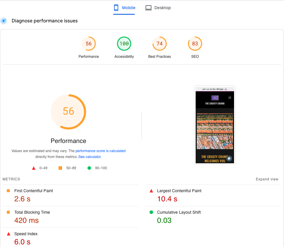
Testers generally found the published website to load quickly and perform well on both desktop and mobile devices. Some mentioned that the app itself can be slow during certain functions.
Load Times
Testers generally found the load times to be satisfactory, with the app performing well in terms of speed and performance.
Google PageSpeed Test
Site Optimization
Site optimization ratings were mixed. But, testers appreciated the app’s automatic optimization of images and other assets for fast load times and smooth performance.
Overall Impression
In conclusion, testers experiences with the Wix app’s SEO-related aspects are diverse. While some found the app’s SEO abilities, mobile optimization, and site performance satisfactory, others encountered limitations in metadata and URL customization. Overall, there is room for improvement in optimizing SEO-related features and enhancing customization options for metadata and URLs.
PERFORMANCE & RELIABILITY
The average rating for aspects related to performance and reliability stands at 67%, signifying a blend of sentiments. Users’ experiences with app stability, responsiveness, comprehensiveness, user guidance, quality assurance, mobile-first design, adaptive layouts, and touch-friendly interactions vary.
Read the full PERFORMANCE & RELIABILITY section
Performance (App)
A mobile website building app that is lightweight should load quickly and operate smoothly, with minimal lag or delays
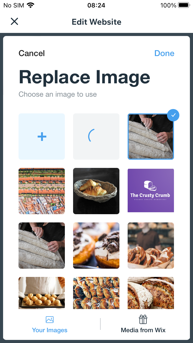
Lags happen very often at random steps. Also sometimes there are bugs like “Done” button not appearing to apply the changes made.
Testers opinions about the app’s stability and reactivity are diverse. While some commended the app’s stability, noting minimal crashes or lag, others reported occasional lags and technical glitches that hinder the user experience.
Stability
While some testers experienced lags and occasional bugs, others found the app stable and without crashes.
Reactivity
Testers had have mixed experiences with the app’s responsiveness, with some finding it quick and others mentioning delays and waiting times for various actions.
Chance at Completion of a Clear and Functional Website
A mobile website building app with a high chance of completion should provide users with the tools and features they need to easily create a website that meets their needs
5 of the things in the Dashboard’s 8 step “Site Step” took me to a screen which said I had to go to a desktop computer to complete them. In some cases this wasn’t even correct. For example, Step 8 was Publish, which I can do from a different part of the app. Also, there are many features or functions that are in higher subscription tiers, and you cannot upgrade in the app.
Testers had mixed experiences with the app’s ability to provide all necessary tools and features for creating a fully functional website. Some found certain features lacking, such as Google Maps integration and SEO metadata editing. Others note that completing certain tasks may require desktop access or higher subscription tiers.
User Guidance
User guidance ratings varied widely. While some testers appreciated the app’s guidance and dummy text examples, others find it lacking and difficult to find the right type of section.
Quality Assurance
Testers mentioned the app’s ability to preview and test websites on different devices and browsers, but some noted limitations in previewing desktop versions.
Responsiveness
There seems to be 2 layouts: 1 for phone and 1 for the rest. I have noticed some drawbacks. In landscape mode on a smartphone, the layout seems like a layout for handicapped people (“super accessibility mode”), because it is the same layout as in portrait mode. On the other hand, on a 8-inch tablet in portrait mode, the font size is generally too small, especially the page menu bar. And the difference of font size between the page title (72px) and the normal text (15px) is too big. So, you feel like the normal text is not a content for you to read.
Users provide ratings that highlight the app’s responsiveness, with scores an average high rating. The app’s mobile-first design approach is praised, as it ensures a positive user experience on smaller screens. Testers also noted that the interface is touch-friendly and easy to navigate on smartphones and tablets.
Mobile-First Design
Testers appreciated the app’s focus on mobile-friendly designs and its WYSIWYG approach on iPhones.
Adaptive Layouts
Testers generally found that the app’s layouts adapt to different screen sizes and orientations, although some mention minor drawbacks.
Touch-Friendly Interactions
Testers found the app’s interface easy to use on touch devices, such as smartphones and tablets.
Overall Impression
Testers had diverse experiences with the app’s performance and reliability. While some found the app stable, responsive, and complete, others encounter lags, limitations, and a need for desktop access for certain tasks. There is room for improvement in ensuring a seamless and user-friendly experience throughout the app.
SUPPORT & DOCUMENTATION
Testers valued the available support options, but the effectiveness of the solutions provided varied. While the documentation’s comprehensiveness is recognized, inconsistencies between the documentation and the app’s functionality can affect the user experience.
Read the full SUPPORT & DOCUMENTATION section
Customer Support
When it comes to customer support, the app receives a range of ratings. This indicates a mixed sentiment among users. The app offers various support channels, including email, live chat, and chat bots, but the availability and effectiveness of these options vary. Some testers found the support system responsive and helpful, while others encounter limitations in terms of accessibility and relevance. The effectiveness of solutions provided during support interactions also elicits differing opinions. The presence of an active community was noted as a positive aspect, even though its level of engagement may fluctuate.
Support Channels
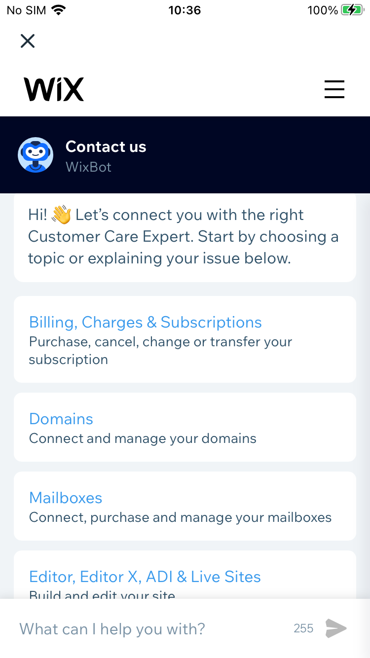
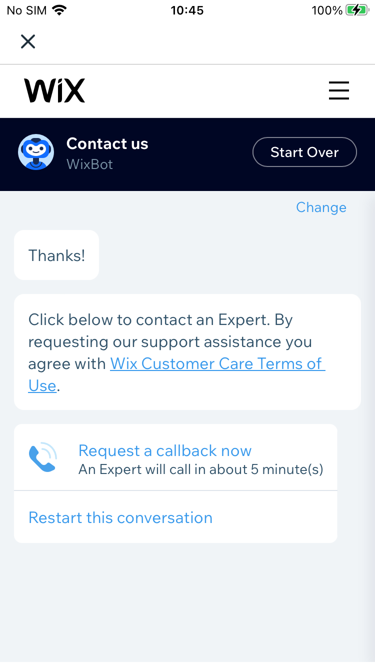
There is an in-app receive-only mailbox. The letters there includes links to a online FAQ. FAQ are displayed in an in-app browser. The chat box is named WixBot. You can get a callback if you are not satisfied by WixBot replies. There is also a “Send Feedback” form.
The app offers a mix of support options, including live chat, email, chat bot, interactive FAQ, and a callback option if the user is not satisfied with the chat bot’s replies. Some testers found the support section robust, although there is no dedicated live help/chat section.
Documentation
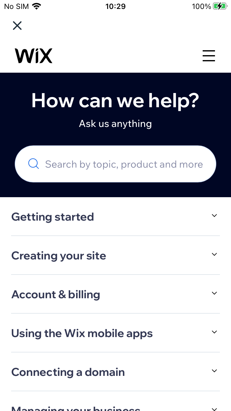
Testers had varying experiences with documentation. The app provides in-app browser access to documentation, but some information may not be applicable to the iOS app. The knowledge base is considered extensive and diverse, but some users encounter discrepancies between the documentation and the app interface.
Community
The app has a community forum and members areas, but its vibrancy and engagement level vary. Testers found the app’s Facebook page, but opinions on the community’s effectiveness differ.
Data Privacy
The app’s transparency about collecting personal data when users stop using the service is mixed. While one tester the app transparent, others found it lacking in transparency. Testers also reported options to close accounts and erase data, but there may be variations in how these actions can be performed.
Overall Impression
The app’s support and documentation garner a mixed reception among users. The provided support channels, including email, live chat, and chat bots, are appreciated by some testers, while others find them lacking or difficult to access. The documentation available is deemed comprehensive by some, offering tutorials, FAQs, and troubleshooting guides, but others note gaps in relevance, especially concerning the mobile app. The response time of support interactions varies, and the effectiveness of solutions provided also receives mixed feedback. The presence of an active user community is seen as a positive aspect, though its engagement and vibrancy vary. The app’s support and documentation offerings cater to diverse needs, improvements could enhance the overall user experience.
PRICING & VALUE
The average rating for pricing and value-related aspects is 59%, indicating mixed sentiment. Testers noted appreciation for the value provided by the free plan but had concerns about pricing transparency and potential limitations in certain areas.
Read the full PRICING & VALUE section
Pricing Tiers
Testers had varying experiences with the app’s pricing tiers. Some found the pricing options flexible, while others mention limitations, such as the inability to change the URL without payment.
Cost-Effectiveness
The app’s cost-effectiveness is perceived differently by testers. Some found the app competitive and offering good value, especially considering the features provided for free. However, there were concerns about aspects like long website URLs and advertisement banners for Wix on published pages.
Transparency
There’s generally a “Premium” banner, or styling/coloring, which makes it easy enough to identify what’s in the free package and what’s not. But since the app doesn’t offer upgrades, and there is no table of features or clear statement of the full differences between plans int he app.. it’s not super clear, no
Transparency in the app’s pricing structure is mixed. Testers mentioned predatory practices and lack of information about pricing. There were noted concerns about domain name costs in subsequent years.
Overall Impression
The app presents multiple pricing tiers, accommodating both free plans and premium options with extended features. While some testers found the pricing flexible and competitive, others expressed concerns about transparency in pricing structures, hidden fees, and limitations in the free plans. In terms of cost-effectiveness, the app garners mixed opinions. Some perceived it as offering good value for the features provided, while others suggested that certain aspects might not align with their expectations. Overall, the app’s pricing strategy and perceived value receive varying assessments from its user base.
FINAL THOUGHTS
The app’s overall score was 66%, indicating a mixed sentiment among testers. Users should carefully consider their specific needs and weigh the app’s advantages and drawbacks before using it.
Our Wix Reviews: Overall Impression
Our reviewers had a diverse range of impressions regarding the app. Some viewed it positively as an effective tool for building websites with relatively few issues, while others perceived it as a supplementary “website manager app” designed to complement desktop-created sites. The app’s reception varies due to its multifaceted nature and its interactions with its desktop counterpart.
I’m not sure I’ve come across a bigger app anywhere, but it’s too clever for it’s own good. Too clever for the user’s good. You can start and finish a website, but the app depends on the desktop for a lot as well. Wix has achieved the impressive feat of at once terrifying me with what’s in the app, and annoying me with how limited it is.
Strengths
Strengths of the app encompass an intuitive user interface and visually appealing design that resonated well with testers. Its extensive functionality stands out, offering a broad spectrum of features ranging from customizable layouts to adaptable extensions, effectively catering to diverse needs. The app’s support and documentation capabilities are highly regarded, with testers valuing the availability of comprehensive guides, support options via email, chat, and FAQs. Furthermore, its adept mobile optimization is evident through the swift loading and seamless performance of mobile-friendly sites across various devices. In terms of value for money, many testers perceived the app to deliver strong worth, offering a wealth of features at competitive price points.
Limitations
The app faces several limitations. Its complexity poses challenges for some users who find it overwhelming, especially when compared to its desktop counterpart. Despite being feature-rich, the mobile app lacks certain functionalities available on the desktop version, leading to user frustration. Transparency issues emerge as users express reservations about concealed fees, unclear pricing structures, and the absence of specific capabilities on free plans. The app’s performance garners mixed opinions, with instances of lag and technical glitches impacting the user experience. Additionally, customization was hampered for some testers who felt constrained in terms of design, layout, and the ability to tailor features according to their preferences.
I think that this app is a helper app (“website manager app”) for people who made their websites on the desktop. It has a good dashboard with access to analytics, instant notification when someone is browsing your website… but as a website builder, it lacks some important features.
Wix Review Conclusion
In conclusion, the app elicits a spectrum of responses from testers. Its user-friendly interface, diverse functionality, and support options contribute to its strengths. However, concerns about complexity, missing features, and transparency issues emerge as limitations. The app’s overall score of 66% reflects the mixed sentiment in terms of its performance, reliability, and value. As with any software, it’s crucial for individuals to assess the app’s fit for their specific needs by considering both its advantages and drawbacks.