
Milkshake App Review
Milkshake’s strengths lie in its mobile-focused design, ease of use, quick website creation, and affordability. However, limitations such as the absence of a desktop layout, limited design customization, and lack of advanced features and functionality hinder its potential for more complex website needs and collaborations.FREE | LITE – $2.99/MONTH
OVERALL RATING
How We Reviewed Milkshake to Find Out if it's More Than Just a Link in Bio Tool
A diverse group of testers were asked to build a website, from start to finish, to assess the strengths and weaknesses of Milkshake from different perspectives:
Read the full HOW WE REVIEW section
- Ease of Use (User Interface and Design)
- Features & Functionality
- SEO (Search Engine Optimization)
- Performance & Reliability
- Support & Documentation
- Pricing & Value
By methodically evaluating these criteria, our testing process aims to provide you with valuable insights into where Milkshake excels and where it is lacking. Ultimately, our objective is to help you choose a website builder which offers a user-friendly, clear experience, and which helps you create an effective and visually pleasing website for your business or project. We also look at whether Milkshake adheres to ethical business principles in its relationship with its users.
For a complete understanding of each review section and its subsections, please refer to our detailed methodology page. If you have more questions, our FAQ and glossary sections are there to provide further clarification.
Milkshake Sign Up Process
Registration
Name, Email, Single Sign On (Google, Apple, ETC)
Setup
Demo, Free Package, Lite
Milkshake App Ease of Use
The Milkshake app’s ease of use has been a point of contention, with ratings averaging around 74%. While some testers found the interface intuitive and easy to navigate, others encountered challenges, especially in terms of navigating the interface. The app adopts a novel approach by allowing users to choose and add different types of Cards, each serving as a page on the site. This innovative concept can be both empowering and slightly complex for newcomers.
Read the full EASE OF USE section
User Interface and Design
For a mobile website building app to be considered easy to use, it should have an intuitive and user-friendly interface that is easy to navigate with touch controls. The app should provide clear and concise instructions on how to use its various features and tools, and it should allow users to easily preview their website and make changes on the go.
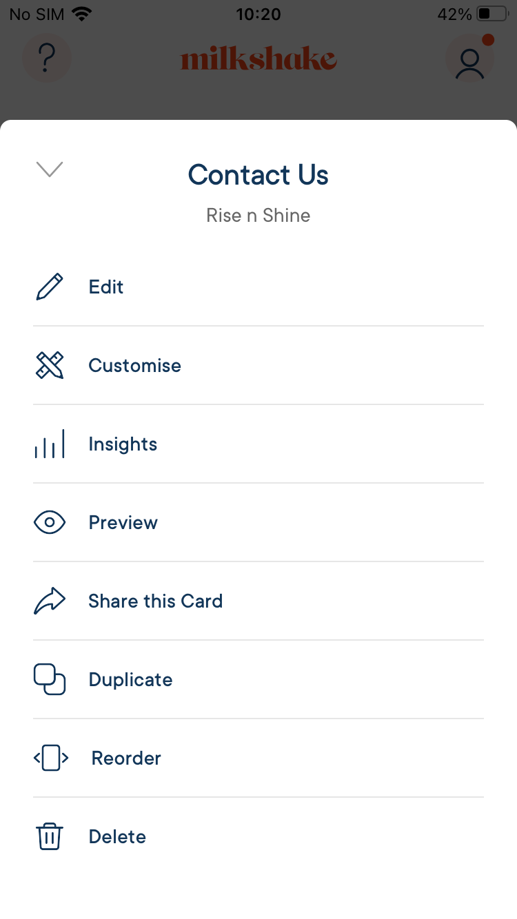
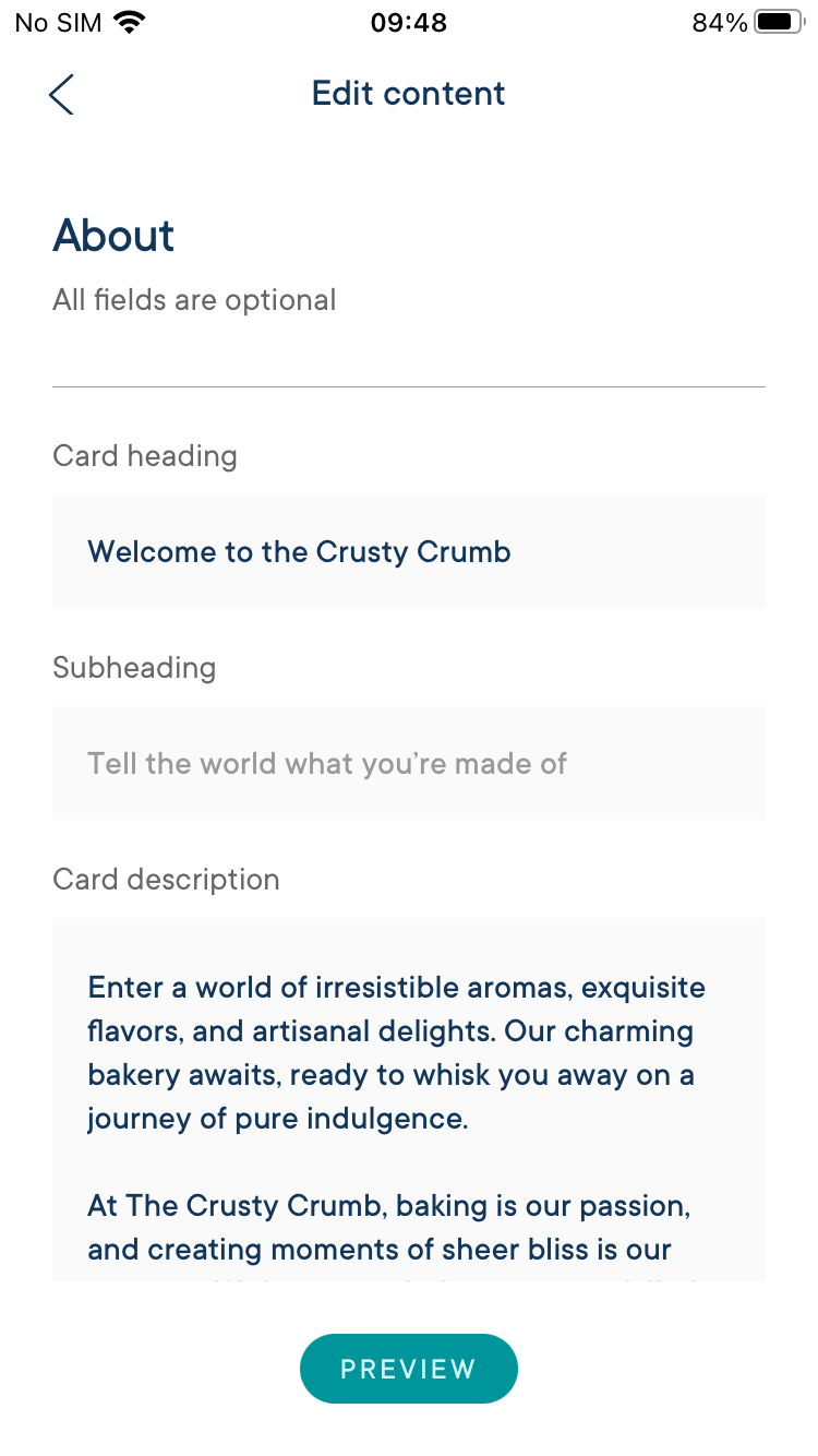
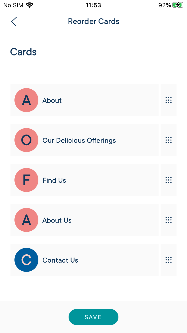
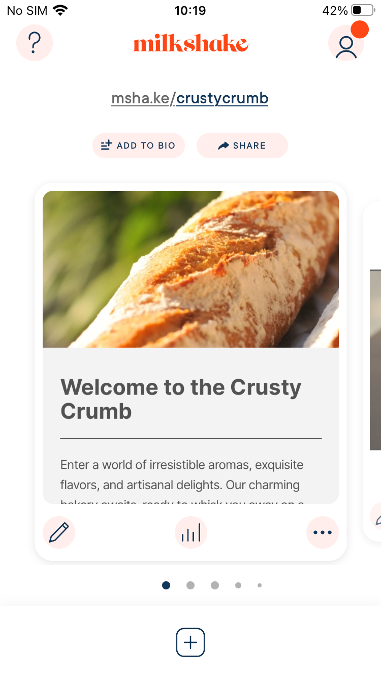
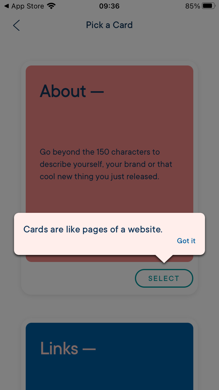
The app offers to choose and add Cards that act as pages of the site (there are 4 kinds of Card). And then choose a theme for a card, add content, visual customization).
Intuitive Interface
Milkshake’s ease of use ratings varied among testers. While some found it straightforward and intuitive, others mentioned that the navigation interface is not always clear. The process of selecting and adding Cards (page types) and customizing themes and content can be confusing for some.
Learning Curve
Testers report that in general, Milkshake is accessible to users of different skill levels, with most testers finding it easy to use, especially beginners. The app’s simple and streamlined nature contributes to its user-friendliness.
Working With Milkshake
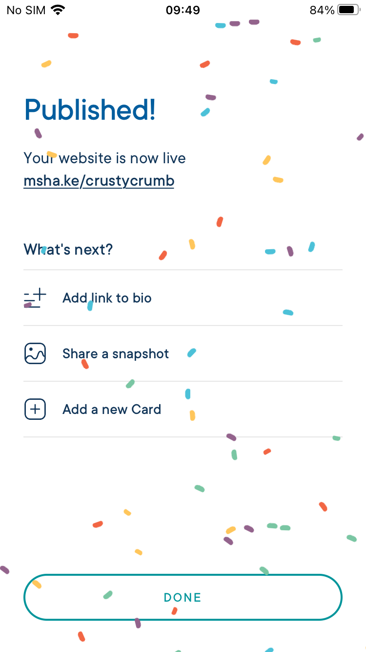
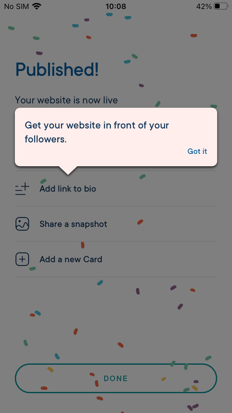
Milkshake allows users to create and publish sites efficiently. The process is reportedly straightforward, with the app guiding users to complete each page and encouraging them to publish their work. This rewards users for their progress.
Clarity
A mobile website building app that is clear should be easy to navigate, with clear and concise labels for all buttons and menus. The app should provide intuitive and logical workflows, so that users can easily find the features they need and accomplish their goals without confusion or frustration.
I felt like I was indeed guided at every step.
Instructions and Tooltips
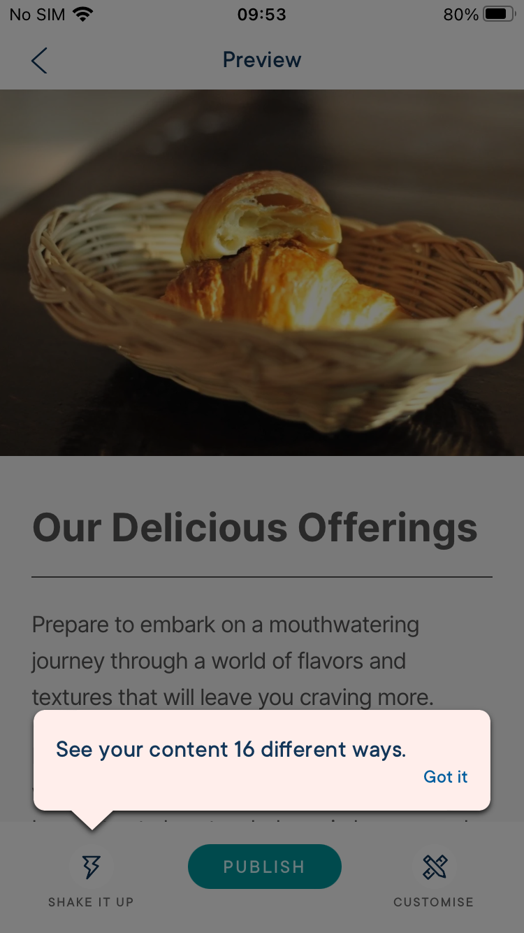
Testers generally found the app’s instructions and tooltips to be clear and helpful, with some even noting the presence of helpful tips. However, a minor point of contention was the visual hierarchy, with one tester mentioning a flat hierarchy that might not suit everyone’s preferences.
Visual Hierarchy
The app is praised for its focused approach, ensuring that users only see what they need to work on. However, there seems to be confusion around the purpose of certain design elements, like the repeating card type at the bottom. Some testers mentioned that the app’s design revolves around creating slideshows, which might not align with everyone’s needs.
Consistency
Consistency is a strong point for Milkshake. Testers appreciated the app’s uniform functionality and behavior, making it easy to understand and predict.
Design
A mobile website building app that is lightweight should load quickly and operate smoothly, with minimal lag or delays.
There are several templates that seem mostly geared towards enhancing social media presence and building vanity pages.
Template Variety
Milkshake falls short in terms of template variety, earning low ratings. Some testers felt that the available templates are mainly geared towards enhancing social media presence and creating vanity pages. While the app offers templates, they lack anything but the most basic customization options, and the structure of each type of page remains unchanged.
Design Flexibility
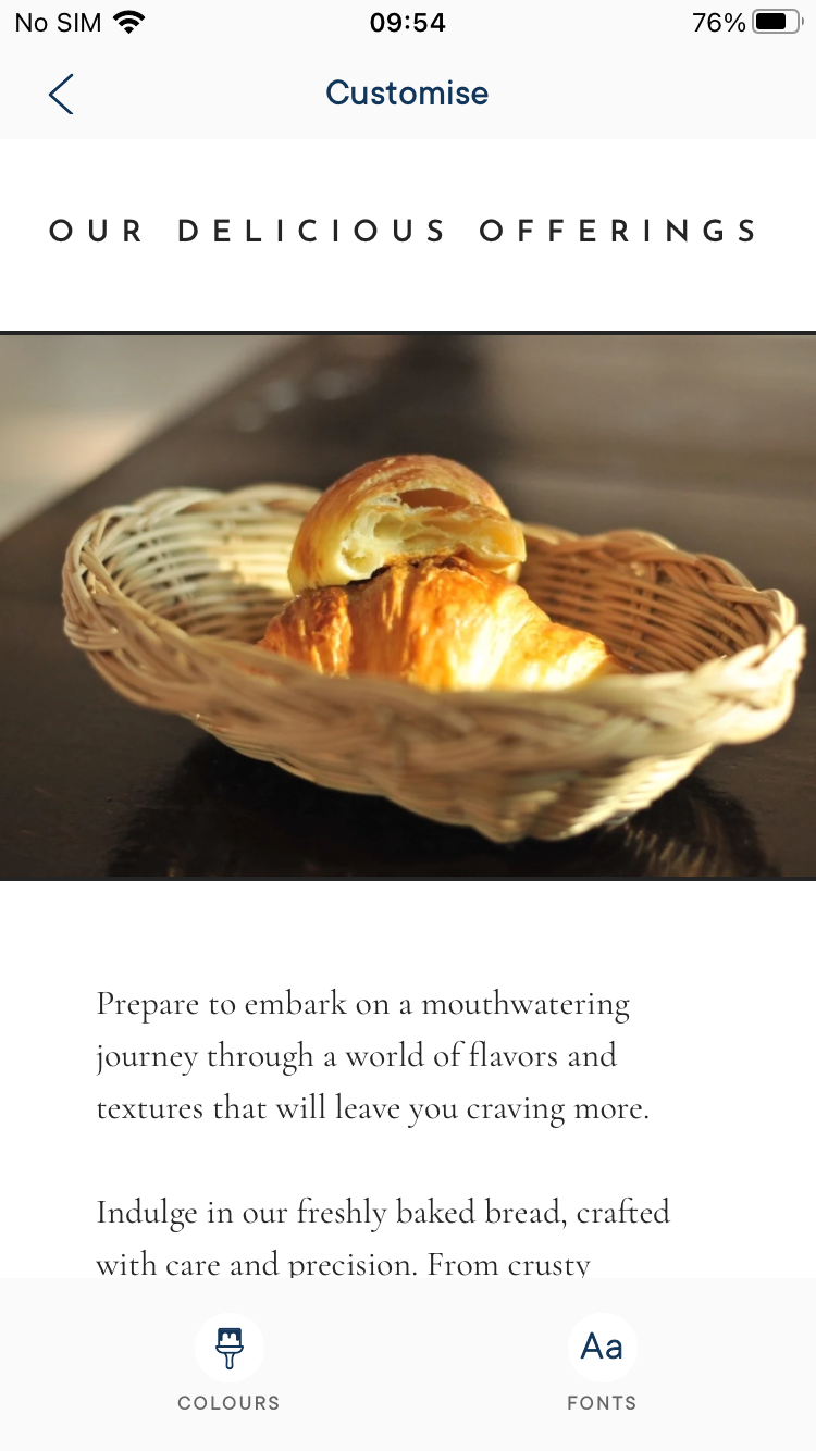
Although the app doesn’t prioritize design flexibility as a primary feature, it does offer some customization options. However, testers mostly found the app’s flexibility to be at a moderate level at best. Testers pointed out that you can choose to apply random automatic redesigns from a selection of variations, which could add an element of surprise to your customization attempts. It’s worth noting that customization options are restricted to changing colors and fonts on a per-page basis, rather than allowing for global design changes across the entire website.
Business Ethics
Business Ethics refers to the principles and considerations that guide the development and usage of the application, ensuring responsible and user-centric practices. It involves adopting ethical standards, maintaining user privacy and security, and prioritizing user experience.
Little focus on quality, but you get a bit more space to present yourself than on Instagram. There is not much incentive to upgrade, as the advertisement card is the last one.
Primary Focus
The app’s focus appears to be creating Bio slideshows primarily for social media, with little emphasis on selling products and services.
Education
Milkshake offers some user education and support, although it’s not the main focus of the app. While it provides enough guidance to help users make informed decisions, it may not cater to those seeking in-depth educational resources.
Quality
The emphasis on content quality ratings varied among testers. While some felt that the app doesn’t prioritize content quality, others noted that it at least offers a platform for creating slightly more detailed presentations than on social media.
Overall Impression
Milkshake has strengths in terms of accessibility, workflow efficiency, clarity, and consistency, but it faces challenges in design, template variety, and overall user experience. The app’s unique focus on creating mobile-centric Bio slideshows might limit its appeal to users with diverse needs.
Milkshake Features & Functionality
The overall assessment of features and functionality is well below average, at 41%. Testers experiences indicate that while Milkshake might suit those seeking minimalistic web presence, it falls short for users requiring comprehensive features, integrations, and multi-language capabilities
Read the full FEATURES & FUNCTIONALITY section
Features
Features refer to the tools, functionality, and capabilities that each app provides for users to build and customize a professional-looking website. Because our review is exclusively of the mobile app, and not of the browser-based builder, a key metric is how much of the website builder’s feature-set is available in the app.
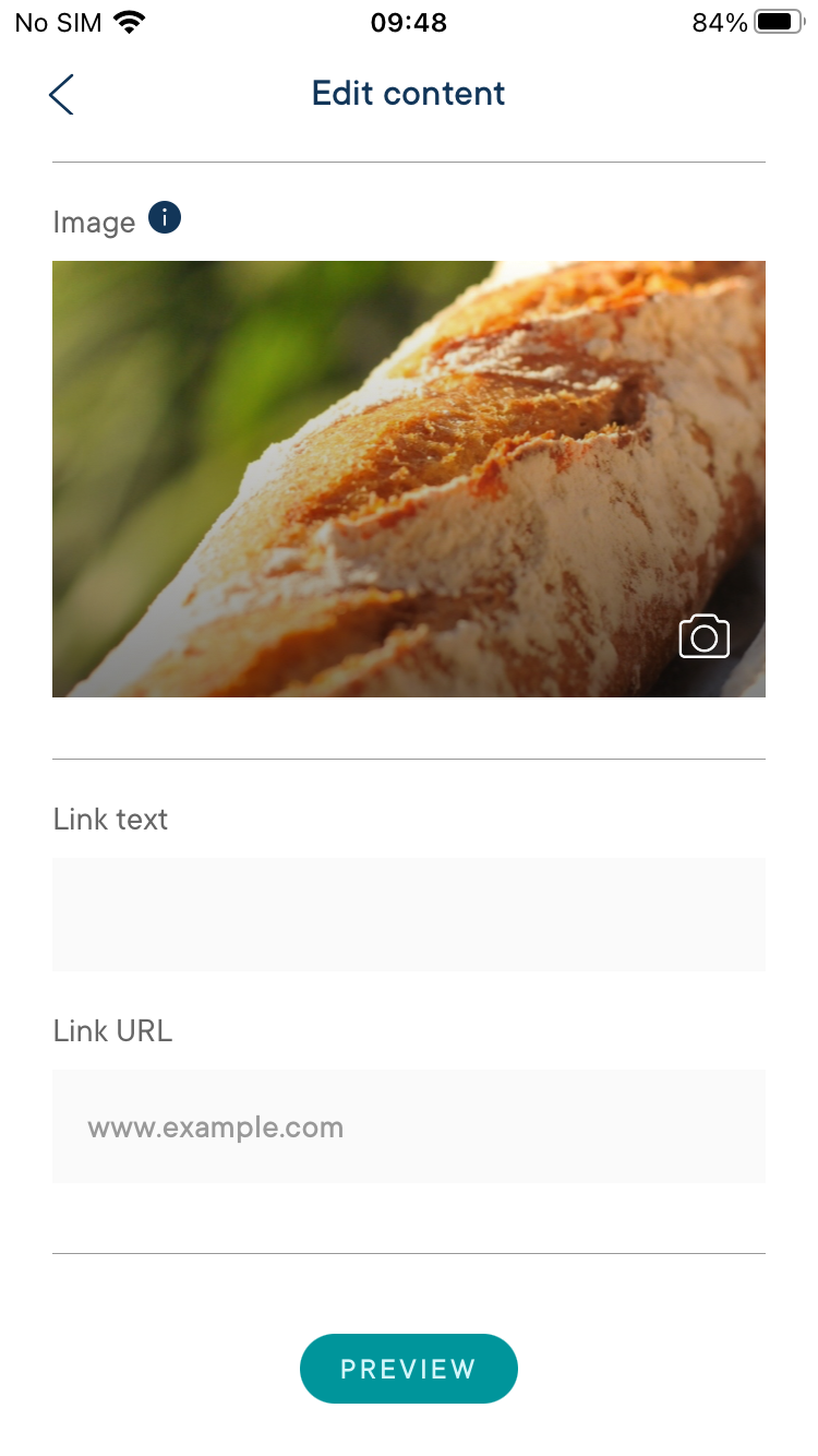
There don’t seem to be any integrations available other than URL links to various services.
Milkshake receives varying ratings for its features, with testers generally finding them limited. The app seems to focus on a specific set of functionalities, which may align with its social media presence extension purpose but falls short for those seeking more robust features.
Functionality
While the app provides clear directions for its capabilities, testers opinions of its functionality were generally poor. Testers mentioned that what functionality there is works, but criticized its lack of depth. There was also an instance of a crash during publishing with the Android app, raising concerns about the app’s stability.
Extensibility
Milkshake lacks extensibility, with testers noting the absence of integrations and plugin support. This limitation may hinder users looking to integrate their web presence with other tools and platforms.
Collaboration
Testers unanimously indicate a lack of collaboration options in Milkshake, making it unsuitable for team-based projects or multiple user access.
Customizability
Customization refers to the level of options and flexibility that the app provides for designing a website.
It’s only possible to use the option to automatically change the layout to another random one and again until you see the one you like.
The app provides limited customizability, with testers acknowledging some options for layout and design adjustments. However, the scope is narrow, and the app may not cater to users who require more extensive customization.
Layout Control
Milkshake offers some layout control through different templates, although the flexibility is limited. Testers mention the option to change layouts, with the new layout being chosen by Milkshake at random, but note that customization is constrained by the single-card-per-page structure.
Design Control
Testers appreciated the ability to control fonts and colors on each “card”, but warned that to provide a consistent site-wide aesthetic, you have to redo the setting on each card.
Feature Control
Milkshake’s feature control received criticism for its limited range of options. The app seems to cater primarily to enhancing social media presence and lacks the comprehensive features needed for diverse website functionality.
Integration options
Integration options refer to the ability of the app to connect and integrate with external services, platforms, or tools to enhance the functionality and capabilities of the website being built.
Only URL links are available for integrations.
Third-Party Integrations
Milkshake’s integrations receive low ratings, with only basic URL links available. While the app supports social media icons, it lacks broader third-party integrations for enhanced functionality.
Seamless Connections
Testers found that social media icons work well within the app, suggesting a seamless connection for this limited feature.
Language Options
The app interface and publishing options are available only in English, leaving out users who speak other languages.
Overall Impression
Milkshake seems tailored for creating simple web pages with a mobile-centric focus, catering to enhancing social media presence. While its user-friendly nature and straightforward approach might suit certain users, those seeking broader functionality, customization, and collaboration options will find the app seriously lacking.
SEO
Milkshake’s SEO capabilities rated 69%. While the app’s mobile optimization and fast load times are highlights, limitations in metadata customization, as well as uncertainties about site optimization, impact its overall effectiveness for SEO-conscious users.
Read the full SEO section
SEO Abilities
SEO (Search Engine Optimization) abilities refer to the app’s ability to help users optimize their website for search engines, such as Google and Bing. By including these SEO features, a mobile website building app can help users improve the visibility and ranking of their website in search engine results, potentially driving more traffic and engagement to their website.
No metadata options available.
Milkshake’s SEO abilities receive mixed but generally positive ratings. While users find it to be geared towards a mobile-only application and acknowledge its mobile optimization, some note limitations in metadata customization and URL customization, which are important aspects of SEO.
Metadata Customization
All testers agreed that Milkshake lacks options for metadata customization, such as editing titles and descriptions.
URL Customization
Milkshake allows URL customization with human-readable page names.
Mobile Optimization
The app’s mobile optimization capabilities were praised by testers, who gave the app consistently high ratings for generating mobile-friendly sites that load quickly and correctly. One tester did mention that this was not the case for larger displays. This aligns with Milkshake’s mobile-focused approach.
Performance (Website)
By prioritizing performance and speed, a website should provide users with a fast and responsive experience, enabling them to quickly and efficiently browse websites from their mobile devices. The second part of this section pertains to the performance and speed of the websites created by the app.
This is geared towards a mobile-only application.
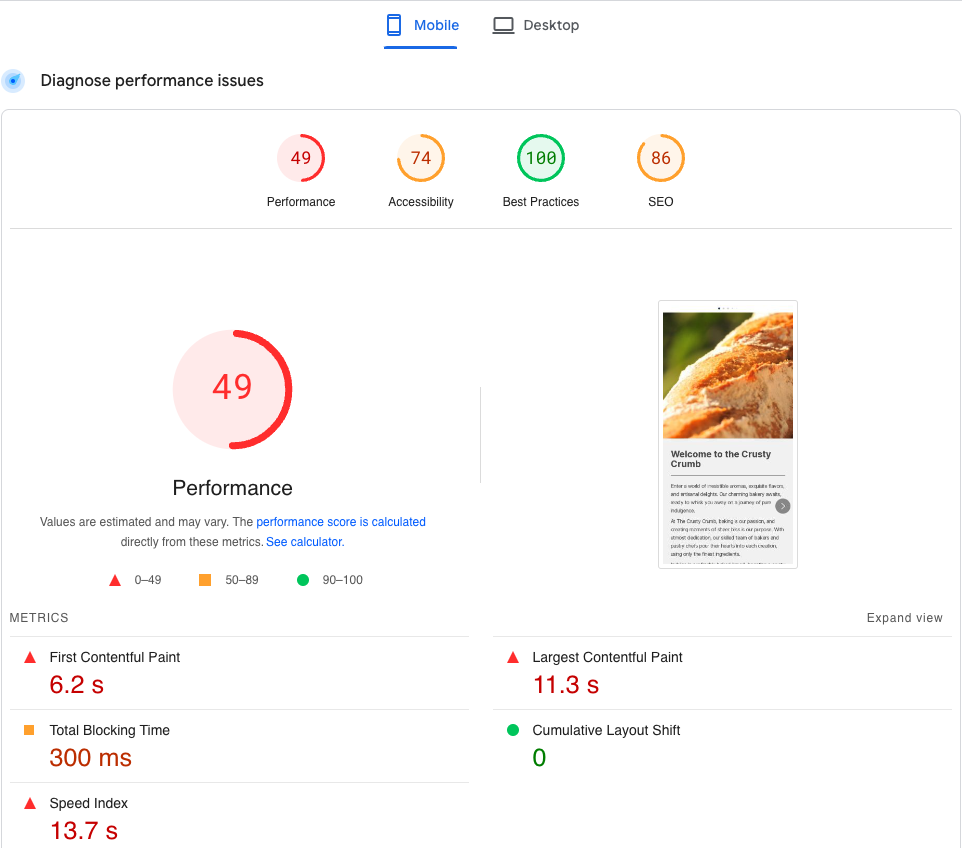
Load times and performance of the published websites received mostly good ratings. Our testers found that websites made by the app were fast and efficient in terms of load times, however it was noted again that websites look and perform better on mobile screens than on desktop.
Load Times
On the whole, Milkshake did a good job here, with websites having snappy loading times. However, content choice will make a difference, because our test included an image compression component, and although Milkshake did compress the large png file our testers were asked to upload, it did not compress it nearly as much as some other apps.
Websites load quickly, but one tester said that on desktop their site didn’t look as expected.
The website loads fast but looks weird on desktop (looks like a modal window)
Google PageSpeed Test
Site Optimization
Testers gave moderate ratings for the app’s site optimization, again mentioning good optimization for phones, but a lack of layout optimization for computers.
Overall Impression
Milkshake appears well-suited for mobile-focused applications, with strong mobile optimization and quick load times. However, not allowing users to edit important meta tags limits its SEO capabilities, and site optimization is also flawed, particularly with respect to how websites look and load on larger displays.
PERFORMANCE AND RELIABILITY
The app’s performance and reliability averages at a strong 80%. Testers found the app stable, responsive, and capable of handling content well. While there are some areas of improvement, such as guidance beyond the basics and adaptation to different screen sizes, the app performed well.
Read the full PERFORMANCE & RELIABILITY section
Performance (App)
A mobile website building app that is lightweight should load quickly and operate smoothly, with minimal lag or delays
Good reactivity. Publishing takes more time than expected, though.
Testers generally found Milkshake’s app performance and reliability to be strong, with ratings consistently above average. The app appears stable, responsive, and well-equipped to handle content and layouts effectively.
Stability
Testers commented positively on the app’s stability, reporting no crashes or significant lags during their testing. The app’s reliability in handling large amounts of content or complex layouts is particularly appreciated.
Reactivity
While testers noted good reactivity overall, there are minor discrepancies in opinions. Some testers mention fast responsiveness, while others point out that certain actions like publishing may take longer than expected.
Chance at Completion of a Clear and Functional Website
A mobile website building app with a high chance of completion should provide users with the tools and features they need to easily create a website that meets their needs.
The app offers clear direction to finish what is admittedly a basic site.
Testers provided varying ratings for the app’s completeness in terms of providing necessary tools to create a fully functional website. While some found the app sufficient for creating basic sites, others highlighted limitations in functionality, such as the absence of a contact form and Google Maps integration.
User Guidance
The app’s user guidance is generally well-received, with users noting clear directions, pre-prompted text, and image suggestions. However, the app seems to lack guidance in areas beyond the basic creation process, such as content creation, design, promotion, and optimization.
Quality Assurance
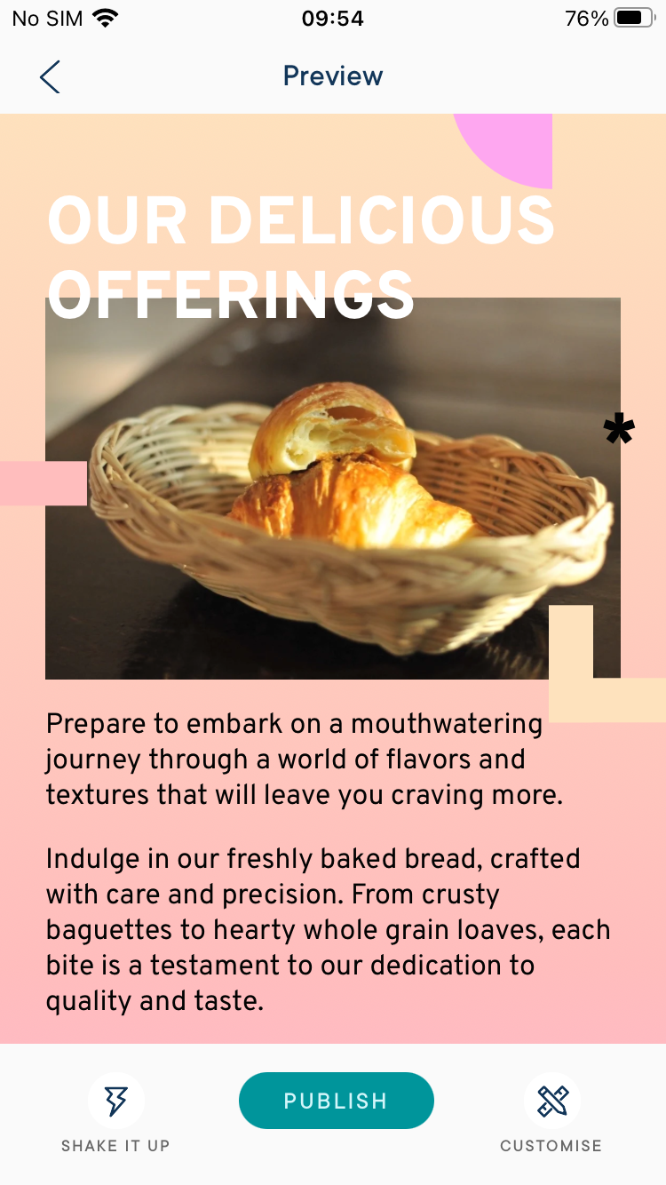
The app’s quality assurance features received positive feedback from testers. They particularly liked the preview options that allow for testing websites on various devices and browsers. However, it’s worth noting that one tester identified a limitation: the preview doesn’t indicate the absence of a computer layout.
Responsiveness
When viewed on a web browser, the app is available only in mobile size and formatting.
The app’s responsiveness garners positive ratings, with testers acknowledging its mobile-first design approach and mobile-friendly interactions. However, websites do not adapt well to different screen sizes and orientations.
Mobile-First Design
Testers unanimously agreed that Milkshake employs a mobile-first design approach, ensuring a good user experience on smaller screens. This aspect of the app’s design receives consistently good ratings.
Adaptive Layouts
There are differing opinions on the app’s adaptive layouts for various screen sizes and orientations. It’s important to note that the app is exclusively available in a mobile size and formatting when accessed through web browsers. Additionally, on mobile devices, it operates solely in portrait mode, lacking a dedicated layout for computer screens.
Touch-Friendly Interactions
Testers generally found the app’s interface to be touch-friendly, suitable for use on smartphones and tablets. However, there were occasional instances of miss-clicks reported. Additionally, some testers pointed out that the “x” in fields with default values, meant for clearing the field, is too small and can be difficult to tap.

Overall Impression
Milkshake’s app performance and reliability are its strong suits, with stability, reactivity, and user guidance being notable strengths. However, the chance of users completing a website with the app, the options for previewing and testing websites, and the responsiveness of websites to different screen sizes all need improving.
SUPPORT & DOCUMENTATION
Testers found Milkshake’s support and documentation barley satisfactory. Milkshake’s support channels include live chat and an interactive FAQ, but the effectiveness and availability of support leave room for improvement.
Read the full SUPPORT & DOCUMENTATION section
Customer Support
The app’s customer support was not rated particularly highly by any of our testers. While there are available support options, including live chat and an interactive FAQ, users noted varying experiences with response times, effectiveness of solutions, and the nature of interactions. It’s possible that the level of support may have decreased due to the app maker recently splitting off from the Envato group and becoming a small independent company.
Support Channels
Testers reported the availability of live chat and an interactive FAQ. However, there were observations about the response not being quick, possibly due to time zone differences. Some testers also found it challenging to locate the email link for support.
Documentation
The app’s documentation received positive feedback from testers overall. Most found it to be comprehensive and readily accessible, with one tester feeling it to be basic but adequate, given the app’s straightforward nature.
Community
Testers noted the lack of an active community within the app for sharing knowledge, advice, and feedback.
Data Privacy
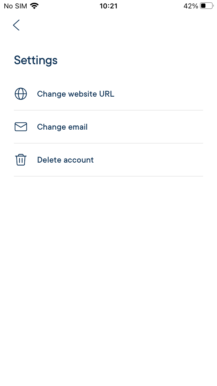
The app is transparent about its data collection policy and offers options to close accounts and erase data.
Overall Impression
In summary, testers had varying experiences with the app’s customer support. While some appreciated the available support options and comprehensive documentation, others found the community aspect lacking and encountered inconsistencies in the support system’s effectiveness. The app’s transparency and options for data privacy are noted positively.
PRICING & VALUE
Milkshake offers competitive pricing tiers, with options including a free plan and a “Lite” plan for $2.99/month (in the US). Milkshake uses regionally adjusted pricing, so the price will be cheaper in some places and more expensive in others. This is actually, in our view, a fairer way of pricing than a flat rate for everyone, regardless of the average level of income and cost-of-living in different countries. Overall the app provides good value for money, especially considering its low price point.
Read the full PRICING & VALUE section
Pricing Tiers
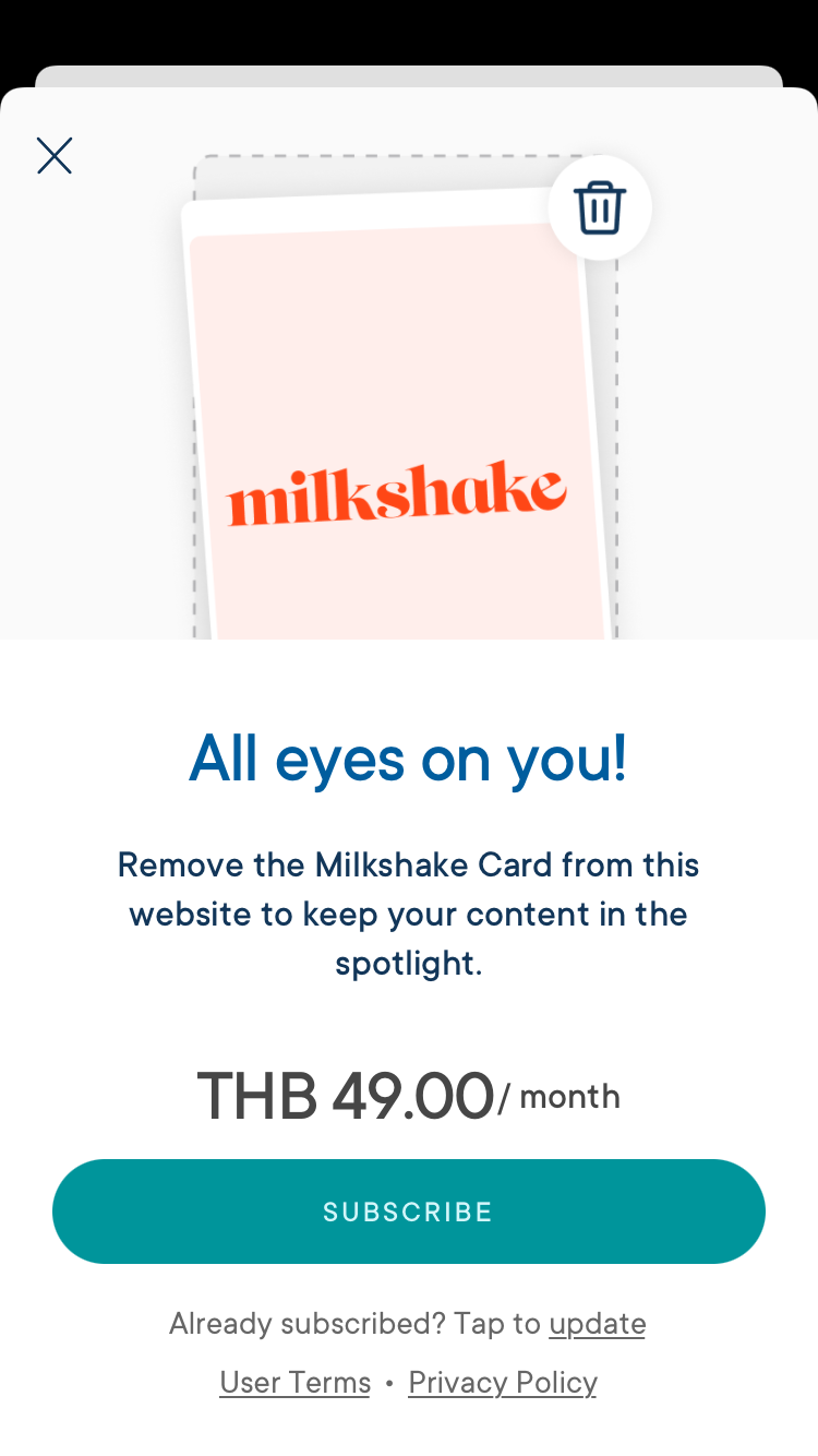
The app offers a variety of pricing options, including a free plan and a premium, “Lite”, plan with additional features. Testers noted that for a monthly fee of $2.99 USD, they can remove the app’s advertising card from their site.
Cost-Effectiveness
Testers had some mixed opinions about the app’s cost-effectiveness. One in particular felt that the app has a target demographic that they did not fit, making it quite it difficult to assess value for money. For the most part our testers found the value good due to the low asking price of the premium plan.
I would say the value is good as the asking price is very low.
Transparency
Testers generally appreciated the app’s transparency in communicating its pricing structure. The pricing offer was considered very clear, and there were no mentions of hidden fees or upsells.
Overall Impression
In summary, testers found the app’s pricing options and transparency about its costs to be generally good. The value for money is perceived positively, with some variation in opinion due to differing tester demographics and perspectives.
Our Reviews Final Thoughts
Testers final impressions of the app were generally positive, with some specific observations and suggestions.
Overall Review Impression
Our testers appreciated the app’s ability to quickly create and publish a unique-looking website for small businesses. The mobile-first design was seen as a positive, particularly for mobile-focused users. However, there is a notable limitation in the app’s lack of layout adaptation to desktop screens, which may reduce its usability for professionals who need desktop accessibility.
Strengths
The app’s strengths lie in its mobile-focused design, ease of use, quick website creation, design customization, and affordability.
Limitations
Limitations such as the absence of a desktop layout, limited functionality, and lack of advanced features hinder its potential for more complex website needs and collaborations.
Conclusion
The overall scores assigned by testers averaged out at 66%. While the app received positive feedback for its quick website creation capabilities and unique design, its lack of desktop layout and limited features are noted drawbacks. The overall impression is positive, with room for improvement in certain areas.