
Crayon Website Builder App Review
Crayon is a website builder app that allows users to create simple websites directly from their mobile phones. Despite its potential, Crayon’s limitations and lack of substantial improvement hinder its ability to deliver a satisfying website building experience.FREE | LIGHT – $24.99 / 3 MONTHS
OVERALL RATING
HOW WE REVIEWED Crayon
A diverse group of testers were asked to build a website, from start to finish, to assess the strengths and weaknesses of Crayon from different perspectives:
Read the full HOW WE REVIEW section
- Ease of Use (User Interface and Design)
- Features & Functionality
- SEO (Search Engine Optimization)
- Performance & Reliability
- Support & Documentation
- Pricing & Value
SIGN UP PROCESS
Registration
Guest Account
Setup
Free Package
EASE OF USE
Crayon faces challenges in terms of its user interface and design, particularly in navigation, clarity, and design flexibility. The app also has room for improvement in terms of business ethics and user support.
Read the full EASE OF USE section
User Interface and Design
For a mobile website building app to be considered easy to use, it should have an intuitive and user-friendly interface that is easy to navigate with touch controls. The app should provide clear and concise instructions on how to use its various features and tools, and it should allow users to easily preview their website and make changes on the go.
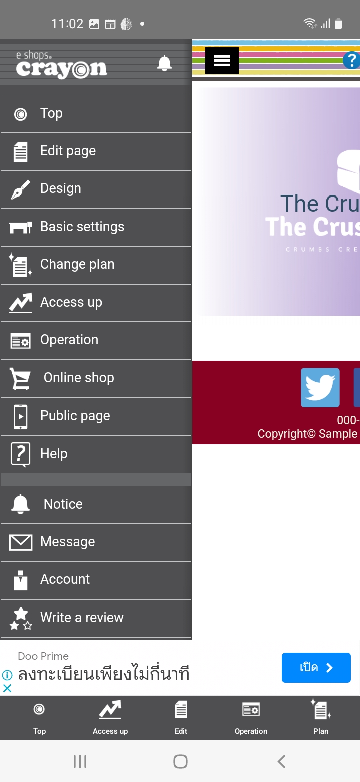
Navigation is hard and very redundant: The Top screen, the left-hand side menu and the bottom bar give more or less access to the same screens of the app.
Intuitive Interface
Crayon struggles with ease of use due to interface navigation issues. While some features are intuitive, the dark mode interface loses functionality, and redundant navigation elements confused testers.
Learning Curve
The poor English translation and placement of essential buttons beneath the fold contribute to a steep learning curve, potentially hindering users’ ability to grasp the app’s functionality.
Working With Crayon
Our testers explained that, even though each specific task can be managed on its own, the overall process is complicated by two primary issues: poor quality language in the interface and less-than-ideal design.
Clarity
A mobile website building app that is clear should be easy to navigate, with clear and concise labels for all buttons and menus. The app should provide intuitive and logical workflows, so that users can easily find the features they need and accomplish their goals without confusion or frustration.
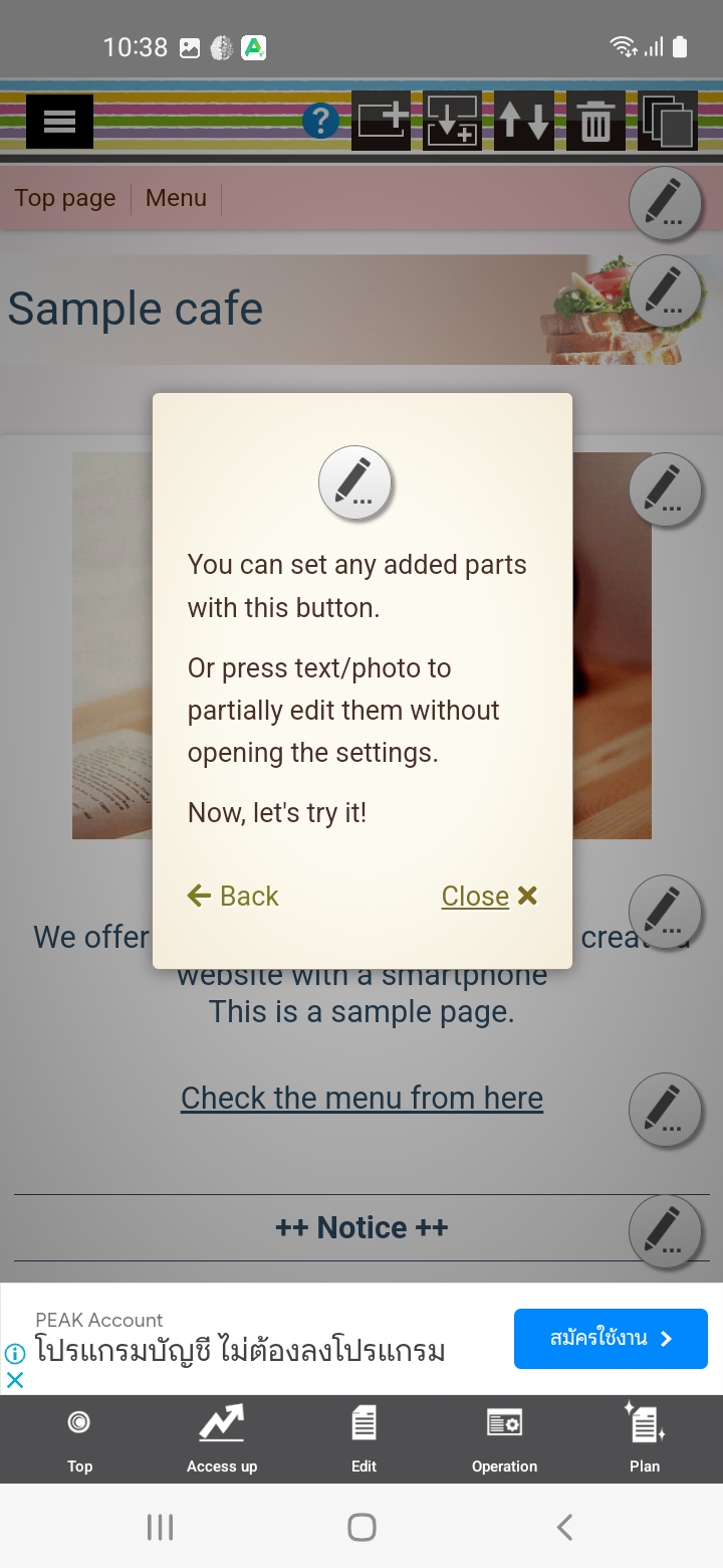
Many tooltips and instructions…. but, it doesn’t compensate for a poor app UI and poor English translation.
Instructions and Tooltips
Testers noted that inconsistent translation and labeling disrupt the usefulness of instructions, tooltips, and the app’s user interface.
Visual Hierarchy
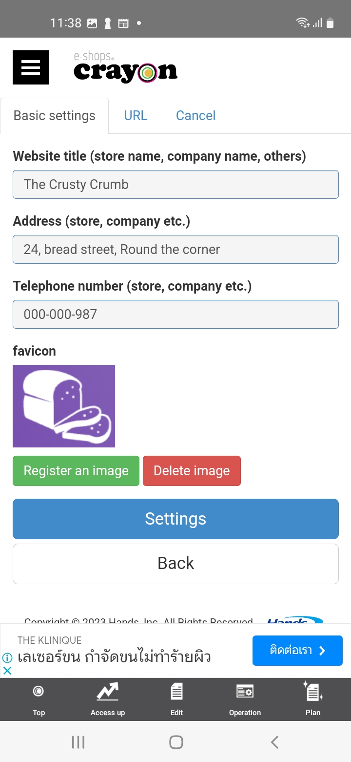
Our testers felt that while the process seems logical once language barriers are overcome, some design elements hinder usability. For instance, the inclusion of multiple section-related buttons and a navigation button on the same row creates confusion. This mixing of unrelated functions on a single row is poor UI practice.
Consistency
The lack of consistency in the app, compounded by the inadequate translation and labeling, creates difficulties for users in predicting what to expect. Testers faced challenges in anticipating actions because of the app’s irregular design and behavior. They also pointed out that finding crucial buttons, such as a concealed “Save” button labeled as “Settings” or “Change,” disrupts the overall user experience.
Design
A mobile website building app that is lightweight should load quickly and operate smoothly, with minimal lag or delays.
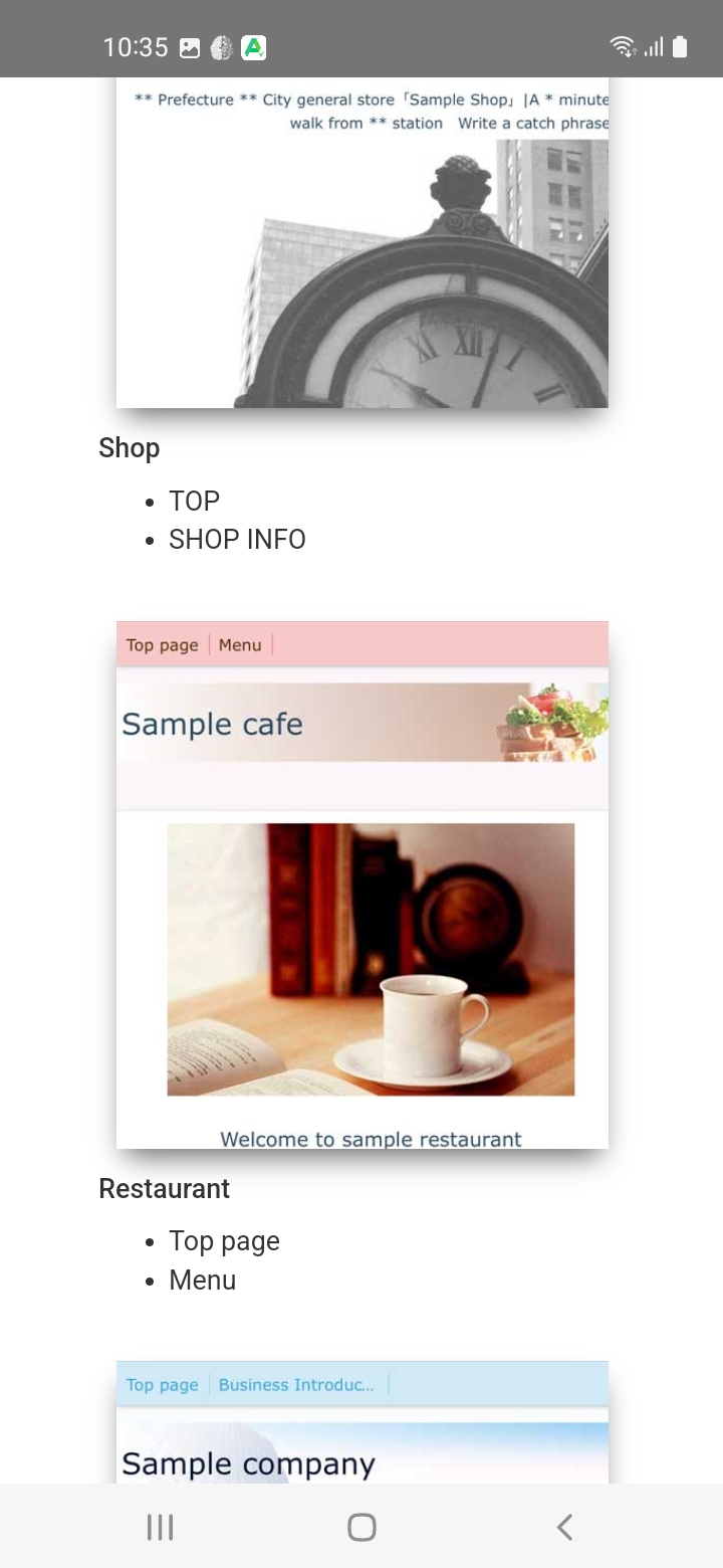
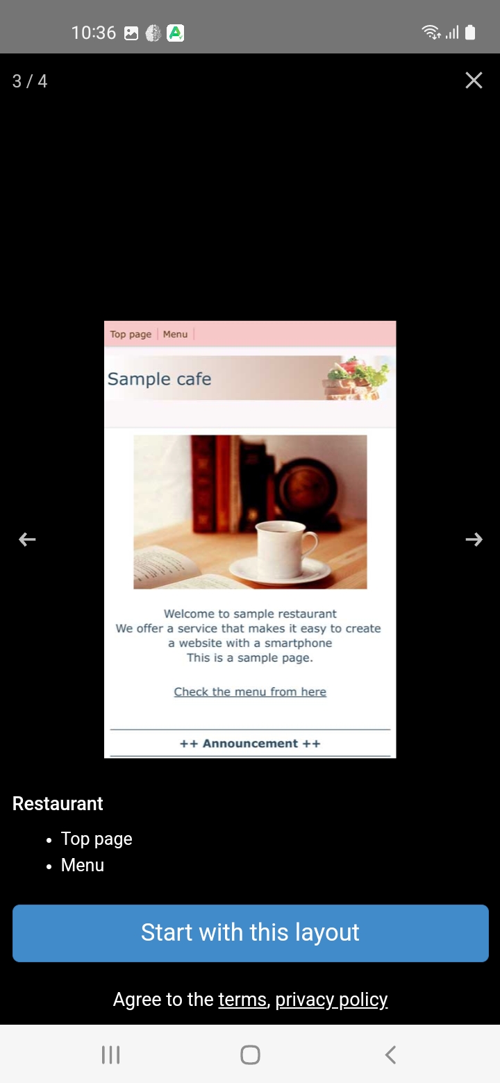
Templates all look the same, even if the main color and if the prefilled content changes.
Template Variety
Our testers gave Crayon app a respectable design score, with templates offering a clear and customizable approach to presenting information. However, the templates lack diversity, and while they allow for some personalization, they still appear uniform after changes to color and content.
Design Flexibility
Crayon offers a moderately flexible design experience. Templates can be changed at any stage, though altering the layout results in data loss. While customization options exist, some settings seem out of place, such as the inclusion of a mobile “hamburger” button for a small number of pages.
Business Ethics
Business Ethics refers to the principles and considerations that guide the development and usage of the application, ensuring responsible and user-centric practices. It involves adopting ethical standards, maintaining user privacy and security, and prioritizing user experience.
Translation is a problem but the App is Helpful.
Primary Focus
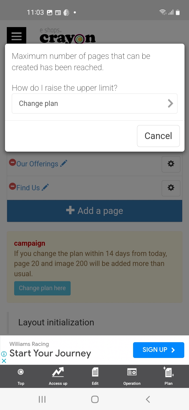
Testers have noted that Crayon’s primary focus on selling products and services is clear, and they have also observed that the limitations in the free plan might encourage users to consider upgrading.
Education
Despite translation issues, the app offers some helpful guidance. However, lack of user support hampers the learning experience.
Quality
Our testers rated Crayon capabilities for producing quality content as functional but not particularly impressive, leading to a very average score here.
Overall Impression
The overall ease of use rating for Crayon’s Website Builder App rating is 60%, indicating mixed tester experiences. Certain aspects of the app were perceived as intuitive and straightforward, while our testers struggled with other features or functionalities. It’s important for the app to address these issues to provide a more cohesive and user-friendly experience across the board.
FEATURES & FUNCTIONALITY
The app offers good functionality, including image and text editing tools, and some extensibility with PayPal and Google Search Console integration, though there are limitations. Collaboration options are limited, affecting its suitability for group projects. Crayon received positive feedback for customizability, with various block types and strong layout, design, and feature controls. However, it fell short in third-party integrations, lacking support for popular tools. In terms of language support, whilst the offers multiple language options for its interface, the translations were poor, and Crayon lacks built-in options for publishing in different languages, limiting its global appeal.
Read the full FEATURES & FUNCTIONALITY section
Features
Features refer to the tools, functionality, and capabilities that each app provides for users to build and customize a professional-looking website. Because our review is exclusively of the mobile app, and not of the browser-based builder, a key metric is how much of the website builder’s feature-set is available in the app.
Functionality
The app performed fairly well in this area. Testers observed that Crayon offers many fundamental website creation tools, such as image and text editing features.
Extensibility
Crayon provides a degree of extensibility by incorporating features like PayPal integration and Google Search Console support. However, the lower ratings given by testers suggest that there may be some limitations and a potential lack of clarity in how it approaches this aspect.
Collaboration
The app lacks in terms of collaboration, receiving low ratings. It does not offer collaboration options or support for multiple users, limiting its usefulness for group or organization projects.
Customizability
Customization refers to the level of options and flexibility that the app provides for designing a website.
Excellent variety of block types: Google Maps, 1-column table, 2-column table , galleries, YouTube videos, slideshows, forms…
This area receives a positive response from testers. The app provides users with flexibility in layout control, design control, and feature control. This allows users to create a tailored content and functionality for their websites.
Layout Control
Crayon excels in providing users with options to customize the layout of pages, offering the ability to add, remove, or rearrange sections. The app’s layout control is functional and flexible, allowing users to duplicate blocks of content and pages. This flexibility grants users the power to craft their designs with precision and ease.
Design Control
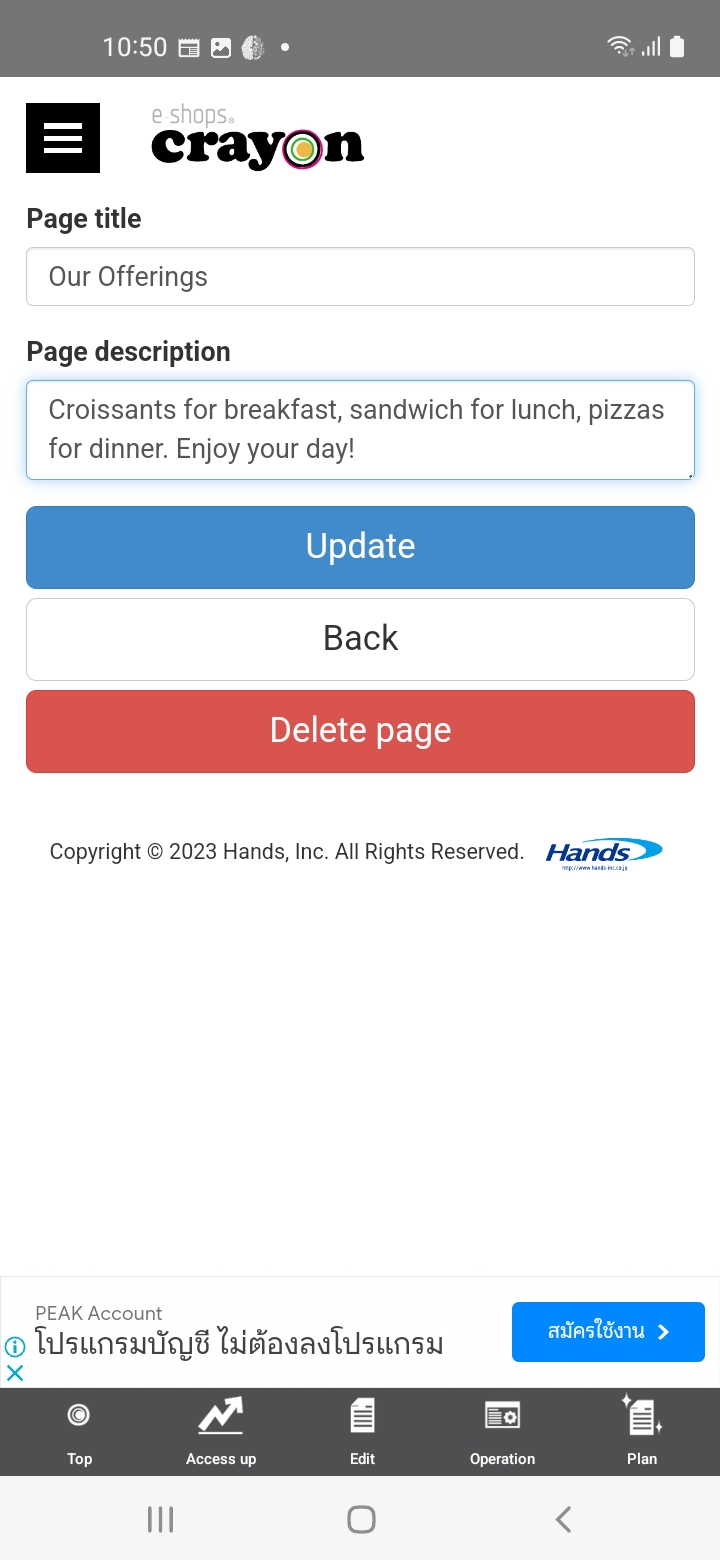
Testers reported that Crayon offers a solid set of features allowing for the modification of design elements such as colors, fonts, and images to create a unique look and feel for their projects. The app provides good control over text color, background color, text alignment, underline or bold decoration, and font size. However, it may have some limitations when it comes to changing the font family. Overall, it offers flexibility for users to tailor their designs to their preferences.
Feature Control
Crayon shines in the realm of feature control, providing users with a wide array of options to customize features like navigation menus, forms, galleries, and more. The app’s flexibility was well received for its rich variety of block types, including Google Maps integration, 1-column and 2-column tables, galleries, YouTube video embedding, slideshows, and forms. This extensive feature set allows users to adapt their website to match their specific requirements, making Crayon a powerful tool for creating diverse content.
Integration options
Integration options refer to the ability of the app to connect and integrate with external services, platforms, or tools to enhance the functionality and capabilities of the website being built.
Crayon’s performance in the integration options category is disappointing.
Third-Party Integrations
Crayon lacks support for third-party integrations, as with limited options for popular tools and services like social media platforms, e-commerce solutions, and analytics tools.
Seamless Connections
The app similarly falls short in ensuring seamless connections with third-party integrations. One of our testers did not find any integrations to test, although this may simply be that they were difficult to discover in the app.
Language Options
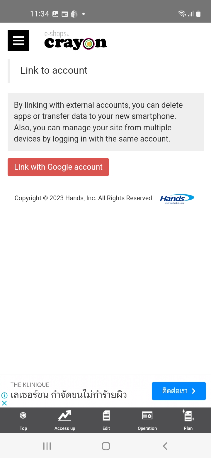
Crayon offers multiple language options for its user interface, however, the absence of built-in options for publishing in different languages limits its relevance for global users.

Overall Impression
The app generally performs well in terms of functionality, offering fundamental website creation tools like image and text editing. It also provides a degree of extensibility with features like PayPal integration and Google Search Console support, though they may be hard to find in the app. Collaboration options are lacking, which hampers its suitability for group projects. Customizability, on the other hand, receives positive feedback, with a variety of block types and robust layout, design, and feature control options. However, Crayon falls short in third-party integrations, lacking support for most popular tools and services, at least in the free version. It offers multiple language options for its interface but lacks built-in options for publishing in different languages, potentially limiting its global appeal.
SEO
Crayon Website Builder’s overall SEO performance is subpar. There is significant room for improvement in optimizing websites for search engines and ensuring smooth performance and accessibility, especially in mobile environments.
Read the full SEO section
SEO Abilities
SEO (Search Engine Optimization) abilities refer to the app’s ability to help users optimize their website for search engines, such as Google and Bing. By including these SEO features, a mobile website building app can help users improve the visibility and ranking of their website in search engine results, potentially driving more traffic and engagement to their website.
You can customize the subdomain, but I haven’t seen any customization for the page names.
While the app provides some SEO capabilities, our testers felt that the app should do much more towards helping users optimize their websites for search engines and improve their online visibility. There are some useful SEO features, but also significant limitations for producing good SEO results.
Metadata Customization
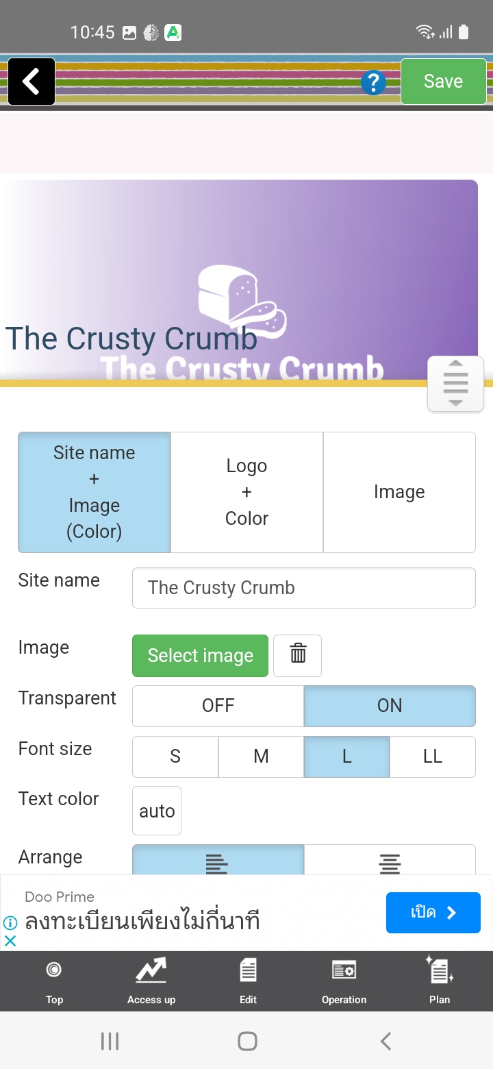
The app demonstrates some level of metadata customization. Users have the ability to edit and customize page titles and descriptions, allowing for a certain degree of optimization for search engines. However, automatic generation of titles and metadata may limit full customization.
URL Customization
Crayon does not allow full URL customization. While subdomain customization is available, the app lacks options to create human-readable page names for URLs, which can severely impact search engine visibility.
Mobile Optimization
Crayon received mixed ratings for mobile optimization. Testers reported that while the app generates mobile-friendly sites that load quickly on some devices, it also faces challenges with mobile performance, as evidenced by poor PageSpeed scores and “Page not found” errors during the publishing process.
Performance (Website)
By prioritizing performance and speed, a website should provide users with a fast and responsive experience, enabling them to quickly and efficiently browse websites from their mobile devices. The second part of this section pertains to the performance and speed of the websites created by the app.
The app is lagging quite a lot
The performance of published websites scored moderately to low. While loading times appear ok on certain devices, the occasional inability to publish and the occurrence of “Page not found”, also known as 404, errors impacted ratings here.
Load Times
Testers evaluation of Crayon Website Builder’s website load times result from a mostly poor performance, with the app earning low to mid ratings. Some testers couldn’t publish at all, others saw reasonable results on some devices, but poor performance on others. Crayon does not ensure consistent and load times and performance across various devices.
Site Optimization
Crayon achieved a poor score again for site optimization. While the app is capable of automatically optimizing images, images were not compressed by much, and the occasional inability to publish meant that some of our testers could not complete this area of testing.
Overall Impression
While some elements, such as metadata customization, showed some SEO potential, there are significant challenges in areas like URL customization, mobile optimization, publishing and website performance.
Our assessment suggests that the app needs to focus on refining its SEO features and addressing the identified issues to provide users with better tools for improving their website’s search engine rankings, mobile responsiveness, and overall performance.
PERFORMANCE & RELIABILITY
Crayon exhibits strengths in mobile-first design and responsiveness, aligning with modern design best practices. However, its performance faces challenges, with interruptions caused by lags and delays during loading and saving operations, contributing to a below-average stability rating. User guidance is generally well-regarded, although translation issues affect its quality. While the app provides most of the tools needed for website creation, one of our testers found that hosting was excluded, and ratings overall indicate mixed potential for successfully completing tasks. Additionally, touch-friendly interactions were generally well-rated, but marred by issues in dark mode and delayed feedback. All in all, performance and translation concerns impact the app’s usability and user experience.
Read the full PERFORMANCE & RELIABILITY section
Performance (App)
A mobile website building app that is lightweight should load quickly and operate smoothly, with minimal lag or delays.
The user experience is interrupted by various lags and delays during loading and saving operations.
Stability
The app’s stability is rated as below average, suggesting that it frequently encounters noticeable lag.
Reactivity
The app’s reactivity, its ability to swiftly respond to user actions, garnered a range of ratings. Although testers acknowledged some level of effectiveness, the experience was marred by delays and lags when loading and saving, resulting in workflow interruptions.
Chance at Completion of a Clear and Functional Website
A mobile website building app with a high chance of completion should provide users with the tools and features they need to easily create a website that meets their needs.
The app provides everything except hosting for the published site.
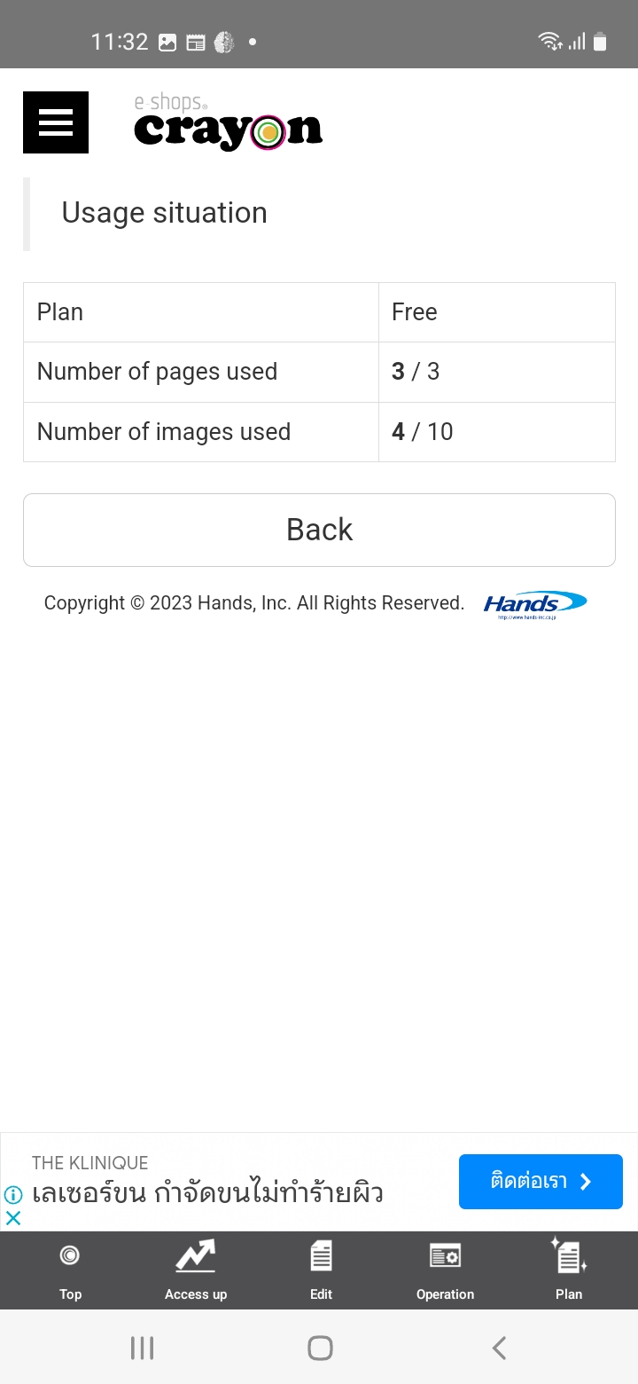
Our testers found that the app offers the essential tools for website creation, albeit with certain limitations in the free plan.
User Guidance
The app’s user guidance and tips were well rated, although testers noted that translation issues affected the perceived quality of the advice offered.
Quality Assurance
The app’s options for previewing and testing websites on various devices and browsers met with mixed reviews. Although preview options are present, there is a notable absence of a comprehensive checklist or wizard.
Responsiveness
I could not publish the website, so I don’t know if the layout is adaptive or not.
While the app shows strength in mobile-first design and responsiveness, there are areas that need improvement to ensure a seamless and consistent experience across different devices and screen sizes. Addressing the issues that contribute to the lower rating could enhance the overall usability of the app.
Mobile-First Design
The app is praised for its mobile-friendly approach, which aligns with current design best practices.
Adaptive Layouts
Crayon received a good rating for offering layouts that automatically adapt to different screen sizes and orientations. While one reviewer couldn’t publish their website to confirm adaptability, other testers found that the app’s design approach shows a commitment to responsiveness.
Touch-Friendly Interactions
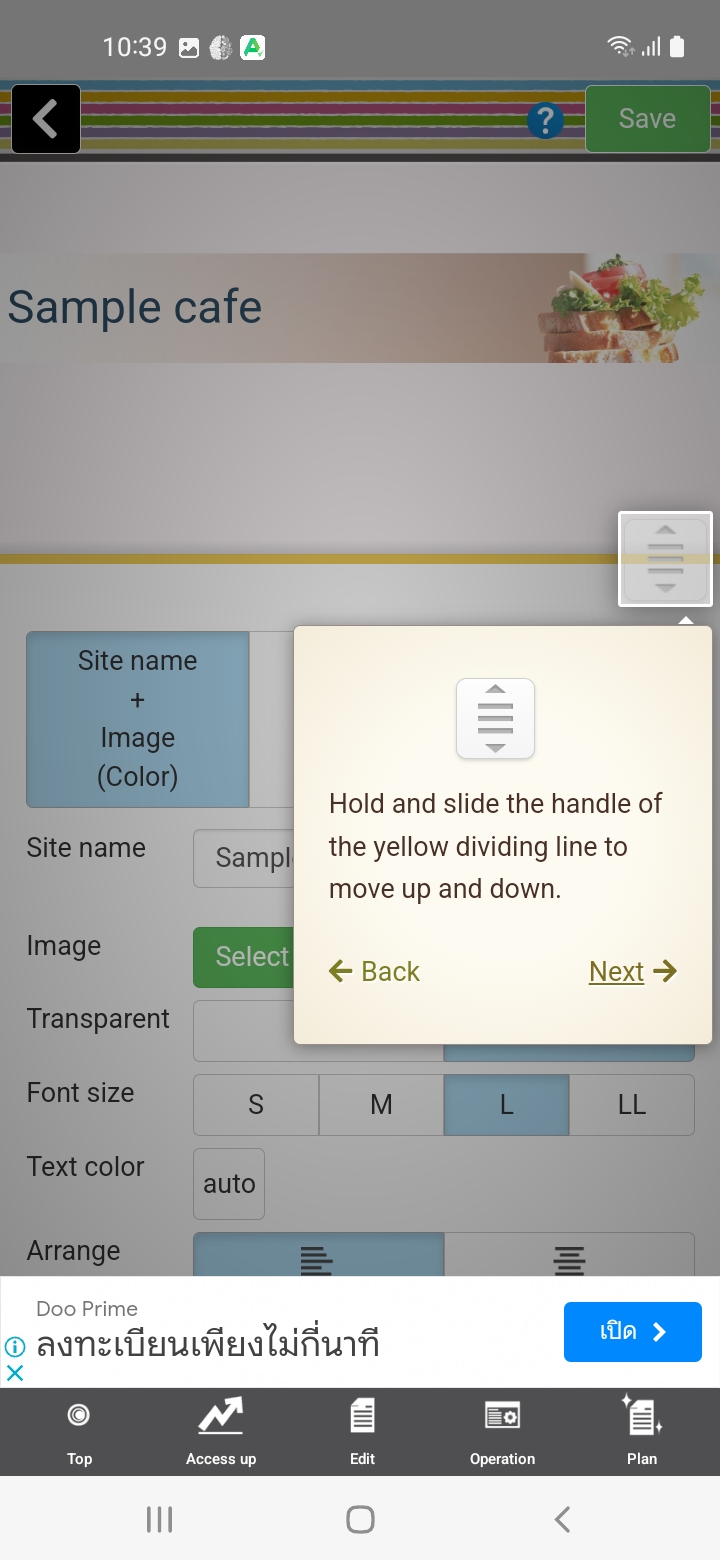
The app’s interface’s ease of use on touch devices received mixed ratings. While generally touch-friendly, issues in dark mode and with delays in feedback were mentioned.
Overall Impression
An average rating of 63% for the Crayon app suggests that the app’s performance and reliability includes both positive aspects and areas that need improvement. While some aspects of working with the app were perceived positively by testers, the app also fell short of providing a completely smooth and reliable user experience.
SUPPORT & DOCUMENTATION
The support and documentation of the app did not fare well with our reviewers. The low ratings in this category can be attributed to a lack of effective customer support, poor documentation, and the absence of an active user community.
Read the full SUPPORT & DOCUMENTATION section
Customer Support
Crayon’s customer support left much to be desired. The app claims to offer multiple support options, including email, live chat, and phone support, but our testers couldn’t find any way to contact their support team.
Support Channels
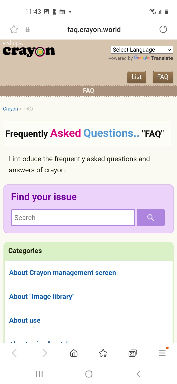
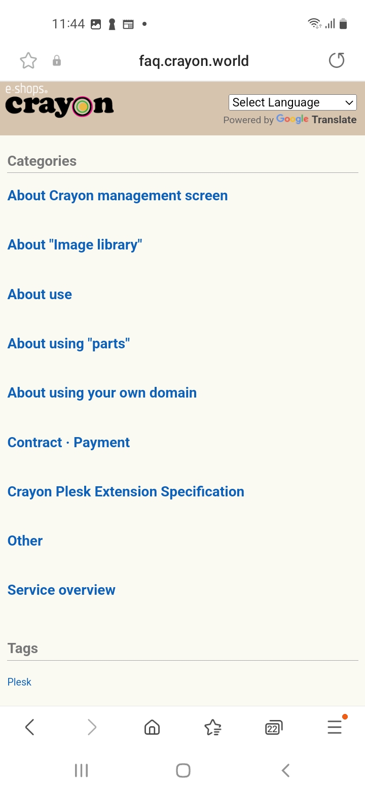
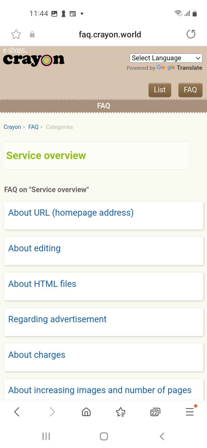
Testers reported that the provided online FAQ was hardly helpful, with poor English and unhelpful content. Furthermore, there seems to be no active community of users to seek assistance from. This lack of effective customer support significantly impacted our testers overall experience.
Documentation
The documentation provided by Crayon was also disappointing. It lacked clarity and was often difficult to understand due to the poor English used. The tutorials, FAQs, and troubleshooting guides were not helpful in resolving issues, and the example provided on Crayon’s website only confirmed these concerns. he documentation needs significant improvement to provide actual assistance to users.
Very poor English. Not helpful.
Community
Crayon has no community or forum features.
Data Privacy
On the positive side, Crayon seemed transparent about its data collection policy, as indicated on their privacy policy page. The option to unpublish, close an account, and erase data was available, ensuring users have control over their personal information. However, the note about account data being potentially stored on the user’s device and backed up on their Google account raised some concerns about data security.
Overall Impression
The combined rating for Support & Documentation was only 30%, painting a bleak picture of Crayon’s ability to assist users effectively. Our reviewers faced significant challenges when seeking support or trying to navigate the available documentation. The app’s lackluster customer support, poorly-written documentation, and absence of a helpful user community have collectively contributed to this disappointing outcome.
PRICING & VALUE
Other than in the area of transparency, Crayon received consistently poor ratings in the Pricing & Value category. While the availability of pricing tiers and the transparency about basic pricing structure are appreciated, the lack of hosting in the free plan noted by one reviewer, lack of clarity about feature differences, and potential hidden fees for domains, all significantly impacted the perceived value for money.
Read the full PRICING & VALUE section
Pricing Tiers
Crayon offers pricing options including a free plan and a paid plan called “Light.” The flexibility of the pricing tiers is limited. While the availability of both free and paid plans is beneficial for users with varied needs, the lack of information about how these plans differ and what specific features they offer raises concerns. The mention of a comparison table resembling something borrowed from another platform raises questions about originality.
Communication about the additional fee for domain name is not very easy to find.
Cost-Effectiveness
The app’s cost-effectiveness received a below-average rating due to significant issues with functionality, particularly the inability to publish. Even if the pricing appears competitive, the compromised functionality of the app clearly undermines the value for money.
Transparency
While Crayon received a relatively high transparency rating for its clear communication of pricing structure, the mention of hidden fees for domain names detracts from this score. The difficulty in finding information about additional domain fees, which are not insignificant, raises concerns about the overall transparency of the pricing model.
Overall Impression
In conclusion, Crayon’s pricing and value proposition has positive aspects such as transparent communication about basic pricing and the availability of different tiers, critical issues like functionality problems and potential hidden fees diminish the overall value users can expect from the app. Addressing these issues is crucial for Crayon to truly offer competitive pricing and deliver meaningful value to its users.
FINAL THOUGHTS
With an average overall score of 52%, Crayon falls short of delivering a well-rounded and effective website building experience. While there are positive aspects, such as mobile accessibility and pricing transparency, the app’s shortcomings in terms of functionality, customer support, and overall user engagement cannot be overlooked. It seems that the app’s development might not be a priority for Hands, which could explain the lack of significant improvement. Crayon may even be partially abandoned, as the iOS app has only been updated twice in 5 years.
Overall Impression
While Crayon does offer a range of plans, including free plan and potentially a more feature rich a Light plan, the execution and value delivered have been inconsistent. The feedback of our testers suggests that the app might be a side-project for Hands, a company focused on B2B e-commerce solutions, which could explain the limitations and lack of significant updates.
Strengths
Crayon’s strengths lie in its ability to allow users to create simple websites directly from their phones. The transparency in pricing, particularly for the basic structure, is also commendable. Moreover, the app appears to have integrated e-commerce functionality, which could be useful for certain users.
Limitations
The limitations of Crayon are significant. Poor customer support, ineffective documentation, and the absence of an active user community have contributed to an unsatisfactory user experience. Additionally, issues with functionality, such as problems with publishing, have severely hindered the value the app provides. Furthermore, the lack of clarity in feature differences across pricing tiers and potential hidden fees for domain names have undermined its overall appeal.
Conclusion
Crayon has potential but requires substantial improvements to address its limitations and provide users with a more valuable and reliable website building platform. Until these issues are resolved, and there’s nothing to suggest they will be, users will find themselves frustrated by the app’s current state and its inability to meet their needs effectively.